A Few Complex Plots
The built-in plotting functionality covers the very simple use cases that are most common. These scripts will demonstrate how to construct more complex plots or publication-quality plots. In many cases these show how to make multi-panel plots.
Multi-Width Image
This is a simple recipe to show how to open a dataset and then plot slices through it at varying widths. See Slice Plots for more information.
import yt

# Load the dataset.
ds = yt.load("IsolatedGalaxy/galaxy0030/galaxy0030")

# Create a slice plot for the dataset.  With no additional arguments,
# the width will be the size of the domain and the center will be the
# center of the simulation box
slc = yt.SlicePlot(ds, "z", ("gas", "density"))

# Create a list of a couple of widths and units.
# (N.B. Mpc (megaparsec) != mpc (milliparsec)
widths = [(1, "Mpc"), (15, "kpc")]

# Loop through the list of widths and units.
for width, unit in widths:
    # Set the width.
    slc.set_width(width, unit)

    # Write out the image with a unique name.
    slc.save("%s_%010d_%s" % (ds, width, unit))

zoomFactors = [2, 4, 5]

# recreate the original slice
slc = yt.SlicePlot(ds, "z", ("gas", "density"))

for zoomFactor in zoomFactors:
    # zoom in
    slc.zoom(zoomFactor)

    # Write out the image with a unique name.
    slc.save("%s_%i" % (ds, zoomFactor))
Varying the resolution of an image
This illustrates the various parameters that control the resolution
of an image, including the (deprecated) refinement level, the size of
the FixedResolutionBuffer,
and the number of pixels in the output image.
In brief, there are three parameters that control the final resolution, with a fourth entering for particle data that is deposited onto a mesh (i.e. pre-4.0). Those are:
1. buff_size, which can be altered with
set_buff_size(), which
is inherited by
AxisAlignedSlicePlot,
OffAxisSlicePlot,
AxisAlignedProjectionPlot, and
OffAxisProjectionPlot. This
controls the number of resolution elements in the
FixedResolutionBuffer,
which can be thought of as the number of individually colored
squares (on a side) in a 2D image. buff_size can be set
after creating the image with
set_buff_size(),
or during image creation with the buff_size argument to any
of the four preceding classes.
2. figure_size, which can be altered with either
set_figure_size(),
or can be set during image creation with the window_size argument.
This sets the size of the final image (including the visualization and,
if applicable, the axes and colorbar as well) in inches.
3. dpi, i.e. the dots-per-inch in your final file, which can also
be thought of as the actual resolution of your image. This can
only be set on save via the mpl_kwargs parameter to
save(). The
dpi and figure_size together set the true resolution of your
image (final image will be dpi \(*\) figure_size pixels on a
side), so if these are set too low, then your buff_size will not
matter. On the other hand, increasing these without increasing
buff_size accordingly will simply blow up your resolution
elements to fill several real pixels.
4. (only for meshed particle data) n_ref, the maximum number of
particles in a cell in the oct-tree allowed before it is refined
(removed in yt-4.0 as particle data is no longer deposited onto
an oct-tree). For particle data, n_ref effectively sets the
underlying resolution of your simulation. Regardless, for either
grid data or deposited particle data, your image will never be
higher resolution than your simulation data. In other words,
if you are visualizing a region 50 kpc across that includes
data that reaches a resolution of 100 pc, then there’s no reason
to set a buff_size (or a dpi \(*\) figure_size) above
50 kpc/ 100 pc = 500.
The below script demonstrates how each of these can be varied.
import numpy as np

import yt

# Load the dataset.  We'll work with a some Gadget data to illustrate all
# the different ways in which the effective resolution can vary.  Specifically,
# we'll use the GadgetDiskGalaxy dataset available at
#  http://yt-project.org/data/GadgetDiskGalaxy.tar.gz

# load the data with a refinement criteria of 2 particle per cell
# n.b. -- in yt-4.0, n_ref no longer exists as the data is no longer
# deposited only a grid.  At present (03/15/2019), there is no way to
# handle non-gas data in Gadget snapshots, though that is work in progress
if int(yt.__version__[0]) < 4:
    # increasing n_ref will result in a "lower resolution" (but faster) image,
    # while decreasing it will go the opposite way
    ds = yt.load("GadgetDiskGalaxy/snapshot_200.hdf5", n_ref=16)
else:
    ds = yt.load("GadgetDiskGalaxy/snapshot_200.hdf5")

# Create projections of the density (max value in each resolution element in the image):
prj = yt.ProjectionPlot(
    ds, "x", ("gas", "density"), method="max", center="max", width=(100, "kpc")
)

# nicen up the plot by using a better interpolation:
plot = prj.plots[list(prj.plots)[0]]
ax = plot.axes
img = ax.images[0]
img.set_interpolation("bicubic")

# nicen up the plot by setting the background color to the minimum of the colorbar
prj.set_background_color(("gas", "density"))

# vary the buff_size -- the number of resolution elements in the actual visualization
# set it to 2000x2000
buff_size = 2000
prj.set_buff_size(buff_size)

# set the figure size in inches
figure_size = 10
prj.set_figure_size(figure_size)

# if the image does not fill the plot (as is default, since the axes and
# colorbar contribute as well), then figuring out the proper dpi for a given
# buff_size and figure_size is non-trivial -- it requires finding the bbox
# for the actual image:
bounding_box = ax.get_position()
# we're going to scale to the larger of the two sides
image_size = figure_size * max([bounding_box.width, bounding_box.height])
# now save with a dpi that's scaled to the buff_size:
dpi = np.rint(np.ceil(buff_size / image_size))
prj.save("with_axes_colorbar.png", mpl_kwargs=dict(dpi=dpi))

# in the case where the image fills the entire plot (i.e. if the axes and colorbar
# are turned off), it's trivial to figure out the correct dpi from the buff_size and
# figure_size (or vice versa):

# hide the colorbar:
prj.hide_colorbar()

# hide the axes, while still keeping the background color correct:
prj.hide_axes(draw_frame=True)

# save with a dpi that makes sense:
dpi = np.rint(np.ceil(buff_size / figure_size))
prj.save("no_axes_colorbar.png", mpl_kwargs=dict(dpi=dpi))
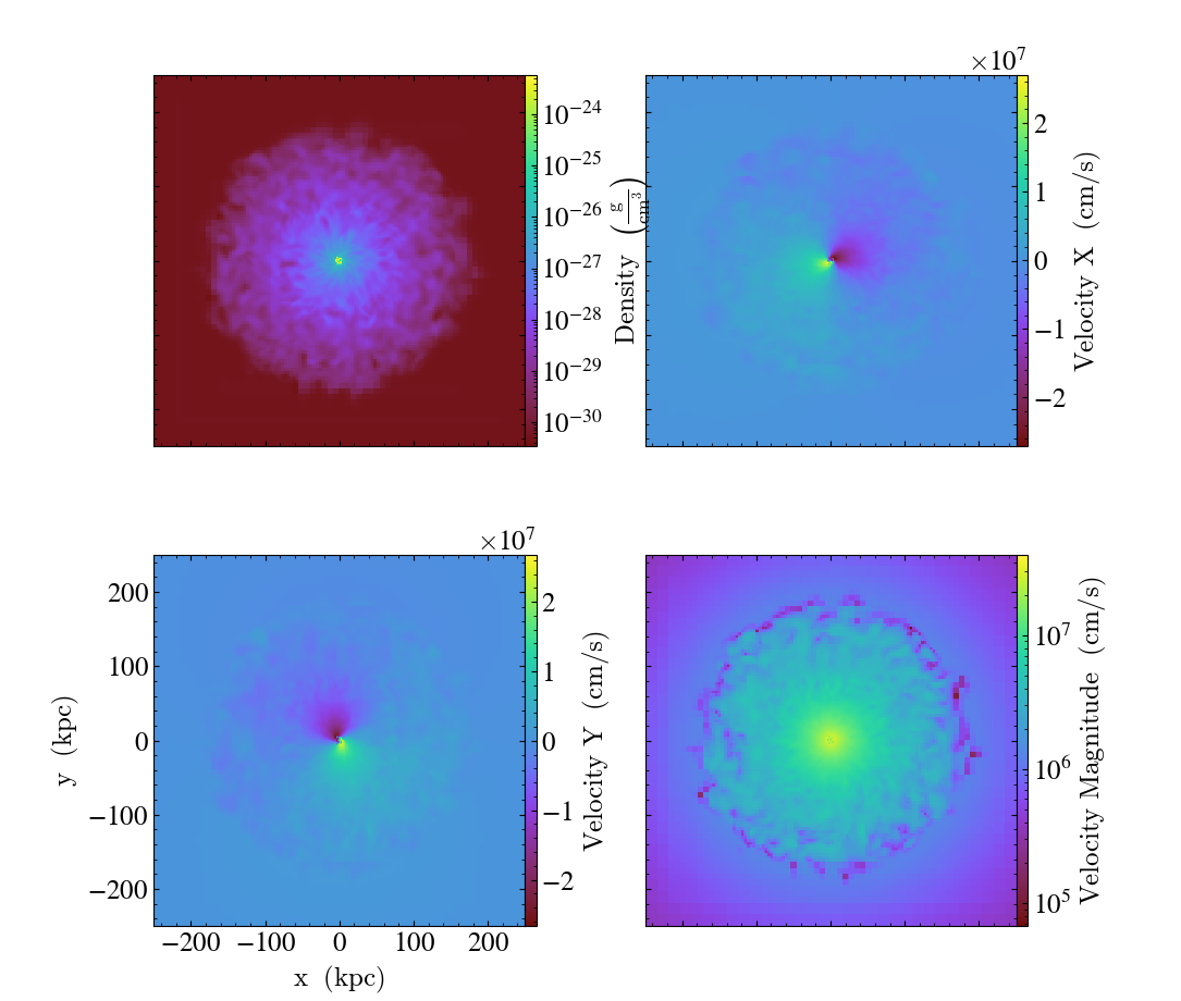
Multipanel with Axes Labels
This illustrates how to use a SlicePlot to control a multipanel plot. This plot uses axes labels to illustrate the length scales in the plot. See Slice Plots and the Matplotlib AxesGrid Object for more information.
import matplotlib.pyplot as plt
from mpl_toolkits.axes_grid1 import AxesGrid

import yt

fn = "IsolatedGalaxy/galaxy0030/galaxy0030"
ds = yt.load(fn)  # load data

fig = plt.figure()

# See http://matplotlib.org/mpl_toolkits/axes_grid/api/axes_grid_api.html
# These choices of keyword arguments produce a four panel plot that includes
# four narrow colorbars, one for each plot.  Axes labels are only drawn on the
# bottom left hand plot to avoid repeating information and make the plot less
# cluttered.
grid = AxesGrid(
    fig,
    (0.075, 0.075, 0.85, 0.85),
    nrows_ncols=(2, 2),
    axes_pad=1.0,
    label_mode="1",
    share_all=True,
    cbar_location="right",
    cbar_mode="each",
    cbar_size="3%",
    cbar_pad="0%",
)

fields = [
    ("gas", "density"),
    ("gas", "velocity_x"),
    ("gas", "velocity_y"),
    ("gas", "velocity_magnitude"),
]

# Create the plot.  Since SlicePlot accepts a list of fields, we need only
# do this once.
p = yt.SlicePlot(ds, "z", fields)

# Velocity is going to be both positive and negative, so let's make these
# slices use a linear colorbar scale
p.set_log(("gas", "velocity_x"), False)
p.set_log(("gas", "velocity_y"), False)

p.zoom(2)

# For each plotted field, force the SlicePlot to redraw itself onto the AxesGrid
# axes.
for i, field in enumerate(fields):
    plot = p.plots[field]
    plot.figure = fig
    plot.axes = grid[i].axes
    plot.cax = grid.cbar_axes[i]

# Finally, redraw the plot on the AxesGrid axes.
p.render()

plt.savefig("multiplot_2x2.png")
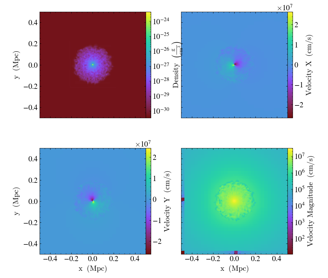
The above example gives you full control over the plots, but for most
purposes, the export_to_mpl_figure method is a simpler option,
allowing us to make a similar plot as:
import yt

ds = yt.load_sample("IsolatedGalaxy")

fields = [
    ("gas", "density"),
    ("gas", "velocity_x"),
    ("gas", "velocity_y"),
    ("gas", "velocity_magnitude"),
]

p = yt.SlicePlot(ds, "z", fields)
p.set_log(("gas", "velocity_x"), False)
p.set_log(("gas", "velocity_y"), False)

# this returns a matplotlib figure with an ImageGrid and the slices
# added to the grid of axes (in this case, 2x2)
fig = p.export_to_mpl_figure((2, 2))

fig.tight_layout()

fig.savefig("multiplot_export_to_mpl.png")
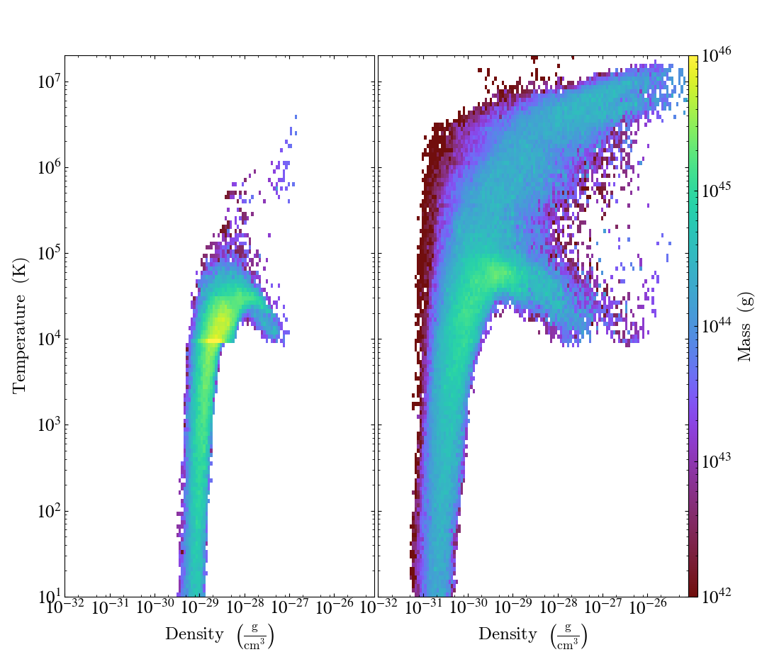
Multipanel with PhasePlot
This illustrates how to use PhasePlot in a multipanel plot. See 2D Phase Plots and the Matplotlib AxesGrid Object for more information.
import matplotlib.pyplot as plt
from mpl_toolkits.axes_grid1 import AxesGrid

import yt

fig = plt.figure()

# See http://matplotlib.org/mpl_toolkits/axes_grid/api/axes_grid_api.html
grid = AxesGrid(
    fig,
    (0.085, 0.085, 0.83, 0.83),
    nrows_ncols=(1, 2),
    axes_pad=0.05,
    label_mode="L",
    share_all=True,
    cbar_location="right",
    cbar_mode="single",
    cbar_size="3%",
    cbar_pad="0%",
    aspect=False,
)

for i, SnapNum in enumerate([10, 40]):
    # Load the data and create a single plot
    ds = yt.load("enzo_tiny_cosmology/DD00%2d/DD00%2d" % (SnapNum, SnapNum))
    ad = ds.all_data()
    p = yt.PhasePlot(
        ad,
        ("gas", "density"),
        ("gas", "temperature"),
        [
            ("gas", "mass"),
        ],
        weight_field=None,
    )

    # Ensure the axes and colorbar limits match for all plots
    p.set_xlim(1.0e-32, 8.0e-26)
    p.set_ylim(1.0e1, 2.0e7)
    p.set_zlim(("gas", "mass"), 1e42, 1e46)

    # This forces the ProjectionPlot to redraw itself on the AxesGrid axes.
    plot = p.plots["gas", "mass"]
    plot.figure = fig
    plot.axes = grid[i].axes
    if i == 0:
        plot.cax = grid.cbar_axes[i]

    # Actually redraws the plot.
    p.render()

    # Modify the axes properties **after** p.render() so that they
    # are not overwritten.
    plot.axes.xaxis.set_minor_locator(plt.LogLocator(base=10.0, subs=[2.0, 5.0, 8.0]))

plt.savefig("multiplot_phaseplot.png")
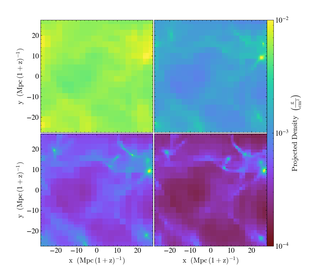
Time Series Multipanel
This illustrates how to create a multipanel plot of a time series dataset. See Projection Plots, Time Series Analysis, and the Matplotlib AxesGrid Object for more information.
(multiplot_2x2_time_series.py)
import matplotlib.pyplot as plt
from mpl_toolkits.axes_grid1 import AxesGrid

import yt

fns = [
    "Enzo_64/DD0005/data0005",
    "Enzo_64/DD0015/data0015",
    "Enzo_64/DD0025/data0025",
    "Enzo_64/DD0035/data0035",
]

fig = plt.figure()

# See http://matplotlib.org/mpl_toolkits/axes_grid/api/axes_grid_api.html
# These choices of keyword arguments produce a four panel plot with a single
# shared narrow colorbar on the right hand side of the multipanel plot. Axes
# labels are drawn for all plots since we're slicing along different directions
# for each plot.
grid = AxesGrid(
    fig,
    (0.075, 0.075, 0.85, 0.85),
    nrows_ncols=(2, 2),
    axes_pad=0.05,
    label_mode="L",
    share_all=True,
    cbar_location="right",
    cbar_mode="single",
    cbar_size="3%",
    cbar_pad="0%",
)

for i, fn in enumerate(fns):
    # Load the data and create a single plot
    ds = yt.load(fn)  # load data
    p = yt.ProjectionPlot(ds, "z", ("gas", "density"), width=(55, "Mpccm"))

    # Ensure the colorbar limits match for all plots
    p.set_zlim(("gas", "density"), 1e-4, 1e-2)

    # This forces the ProjectionPlot to redraw itself on the AxesGrid axes.
    plot = p.plots["gas", "density"]
    plot.figure = fig
    plot.axes = grid[i].axes
    plot.cax = grid.cbar_axes[i]

    # Finally, this actually redraws the plot.
    p.render()

plt.savefig("multiplot_2x2_time_series.png")
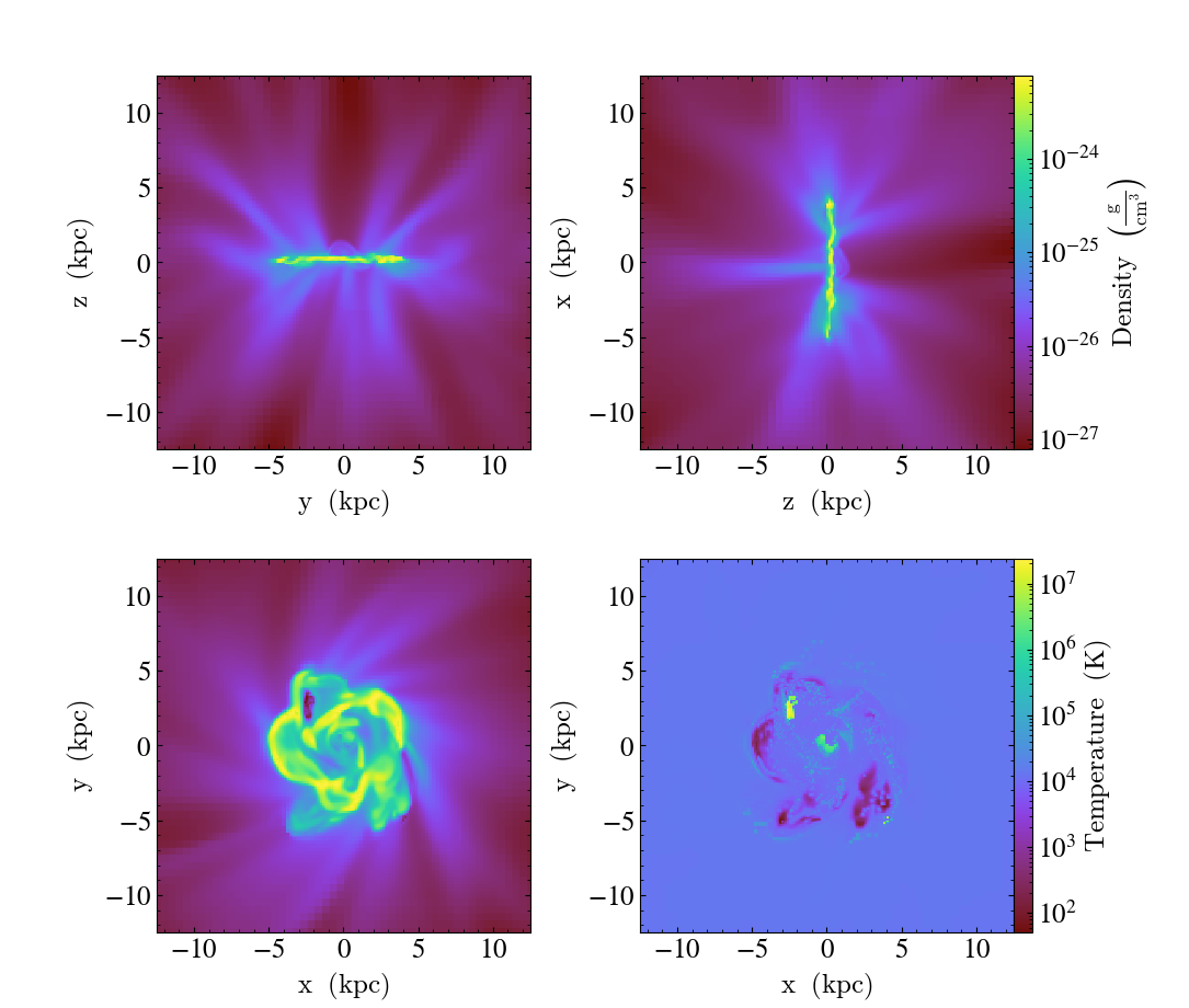
Multiple Slice Multipanel
This illustrates how to create a multipanel plot of slices along the coordinate axes. To focus on what’s happening in the x-y plane, we make an additional Temperature slice for the bottom-right subpanel. See Slice Plots and the Matplotlib AxesGrid Object for more information.
(multiplot_2x2_coordaxes_slice.py)
import matplotlib.pyplot as plt
from mpl_toolkits.axes_grid1 import AxesGrid

import yt

fn = "IsolatedGalaxy/galaxy0030/galaxy0030"
ds = yt.load(fn)  # load data

fig = plt.figure()

# See http://matplotlib.org/mpl_toolkits/axes_grid/api/axes_grid_api.html
# These choices of keyword arguments produce two colorbars, both drawn on the
# right hand side.  This means there are only two colorbar axes, one for Density
# and another for temperature.  In addition, axes labels will be drawn for all
# plots.
grid = AxesGrid(
    fig,
    (0.075, 0.075, 0.85, 0.85),
    nrows_ncols=(2, 2),
    axes_pad=1.0,
    label_mode="all",
    share_all=True,
    cbar_location="right",
    cbar_mode="edge",
    cbar_size="5%",
    cbar_pad="0%",
)

cuts = ["x", "y", "z", "z"]
fields = [
    ("gas", "density"),
    ("gas", "density"),
    ("gas", "density"),
    ("gas", "temperature"),
]

for i, (direction, field) in enumerate(zip(cuts, fields)):
    # Load the data and create a single plot
    p = yt.SlicePlot(ds, direction, field)
    p.zoom(40)

    # This forces the ProjectionPlot to redraw itself on the AxesGrid axes.
    plot = p.plots[field]
    plot.figure = fig
    plot.axes = grid[i].axes

    # Since there are only two colorbar axes, we need to make sure we don't try
    # to set the temperature colorbar to cbar_axes[4], which would if we used i
    # to index cbar_axes, yielding a plot without a temperature colorbar.
    # This unnecessarily redraws the Density colorbar three times, but that has
    # no effect on the final plot.
    if field == ("gas", "density"):
        plot.cax = grid.cbar_axes[0]
    elif field == ("gas", "temperature"):
        plot.cax = grid.cbar_axes[1]

    # Finally, redraw the plot.
    p.render()

plt.savefig("multiplot_2x2_coordaxes_slice.png")
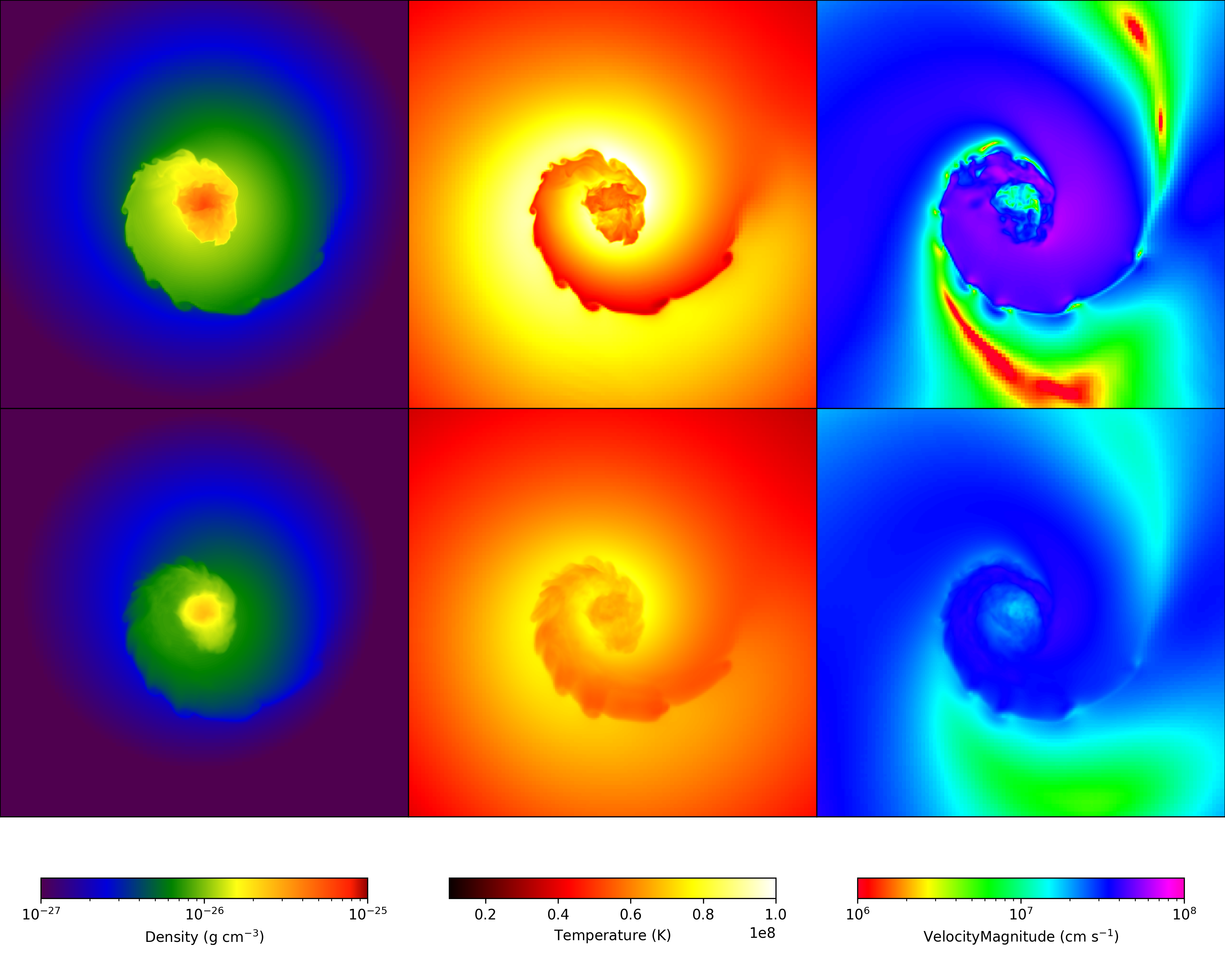
Multi-Plot Slice and Projections
This shows how to combine multiple slices and projections into a single image, with detailed control over colorbars, titles and color limits. See Slice Plots and Projection Plots for more information.
(multi_plot_slice_and_proj.py)
import numpy as np
from matplotlib.colors import LogNorm

import yt
from yt.visualization.base_plot_types import get_multi_plot

fn = "GasSloshing/sloshing_nomag2_hdf5_plt_cnt_0150"  # dataset to load
orient = "horizontal"

ds = yt.load(fn)  # load data

# There's a lot in here:
#   From this we get a containing figure, a list-of-lists of axes into which we
#   can place plots, and some axes that we'll put colorbars.
# We feed it:
#   Number of plots on the x-axis, number of plots on the y-axis, and how we
#   want our colorbars oriented.  (This governs where they will go, too.
#   bw is the base-width in inches, but 4 is about right for most cases.
fig, axes, colorbars = get_multi_plot(3, 2, colorbar=orient, bw=4)

slc = yt.SlicePlot(
    ds,
    "z",
    fields=[("gas", "density"), ("gas", "temperature"), ("gas", "velocity_magnitude")],
)
proj = yt.ProjectionPlot(ds, "z", ("gas", "density"), weight_field=("gas", "density"))

slc_frb = slc.data_source.to_frb((1.0, "Mpc"), 512)
proj_frb = proj.data_source.to_frb((1.0, "Mpc"), 512)

dens_axes = [axes[0][0], axes[1][0]]
temp_axes = [axes[0][1], axes[1][1]]
vels_axes = [axes[0][2], axes[1][2]]

for dax, tax, vax in zip(dens_axes, temp_axes, vels_axes):
    dax.xaxis.set_visible(False)
    dax.yaxis.set_visible(False)
    tax.xaxis.set_visible(False)
    tax.yaxis.set_visible(False)
    vax.xaxis.set_visible(False)
    vax.yaxis.set_visible(False)

# Converting our Fixed Resolution Buffers to numpy arrays so that matplotlib
# can render them

slc_dens = np.array(slc_frb["gas", "density"])
proj_dens = np.array(proj_frb["gas", "density"])
slc_temp = np.array(slc_frb["gas", "temperature"])
proj_temp = np.array(proj_frb["gas", "temperature"])
slc_vel = np.array(slc_frb["gas", "velocity_magnitude"])
proj_vel = np.array(proj_frb["gas", "velocity_magnitude"])

plots = [
    dens_axes[0].imshow(slc_dens, origin="lower", norm=LogNorm()),
    dens_axes[1].imshow(proj_dens, origin="lower", norm=LogNorm()),
    temp_axes[0].imshow(slc_temp, origin="lower"),
    temp_axes[1].imshow(proj_temp, origin="lower"),
    vels_axes[0].imshow(slc_vel, origin="lower", norm=LogNorm()),
    vels_axes[1].imshow(proj_vel, origin="lower", norm=LogNorm()),
]

plots[0].set_clim((1.0e-27, 1.0e-25))
plots[0].set_cmap("bds_highcontrast")
plots[1].set_clim((1.0e-27, 1.0e-25))
plots[1].set_cmap("bds_highcontrast")
plots[2].set_clim((1.0e7, 1.0e8))
plots[2].set_cmap("hot")
plots[3].set_clim((1.0e7, 1.0e8))
plots[3].set_cmap("hot")
plots[4].set_clim((1e6, 1e8))
plots[4].set_cmap("gist_rainbow")
plots[5].set_clim((1e6, 1e8))
plots[5].set_cmap("gist_rainbow")

titles = [
    r"$\mathrm{Density}\ (\mathrm{g\ cm^{-3}})$",
    r"$\mathrm{Temperature}\ (\mathrm{K})$",
    r"$\mathrm{Velocity Magnitude}\ (\mathrm{cm\ s^{-1}})$",
]

for p, cax, t in zip(plots[0:6:2], colorbars, titles):
    cbar = fig.colorbar(p, cax=cax, orientation=orient)
    cbar.set_label(t)

# And now we're done!
fig.savefig(f"{ds}_3x2")
Advanced Multi-Plot Multi-Panel
This produces a series of slices of multiple fields with different color maps and zlimits, and makes use of the FixedResolutionBuffer. While this is more complex than the equivalent plot collection-based solution, it allows for a lot more flexibility. Every part of the script uses matplotlib commands, allowing its full power to be exercised. See Slice Plots and Projection Plots for more information.
import numpy as np
from matplotlib.colors import LogNorm

import yt
from yt.visualization.api import get_multi_plot

fn = "Enzo_64/RD0006/RedshiftOutput0006"  # dataset to load

# load data and get center value and center location as maximum density location
ds = yt.load(fn)
v, c = ds.find_max(("gas", "density"))

# set up our Fixed Resolution Buffer parameters: a width, resolution, and center
width = (1.0, "unitary")
res = [1000, 1000]
#  get_multi_plot returns a containing figure, a list-of-lists of axes
#   into which we can place plots, and some axes that we'll put
#   colorbars.

#  it accepts: # of x-axis plots, # of y-axis plots, and how the
#  colorbars are oriented (this also determines where they go: below
#  in the case of 'horizontal', on the right in the case of
#  'vertical'), bw is the base-width in inches (4 is about right for
#  most cases)

orient = "horizontal"
fig, axes, colorbars = get_multi_plot(2, 3, colorbar=orient, bw=6)

# Now we follow the method of "multi_plot.py" but we're going to iterate
# over the columns, which will become axes of slicing.
plots = []
for ax in range(3):
    sli = ds.slice(ax, c[ax])
    frb = sli.to_frb(width, res)
    den_axis = axes[ax][0]
    temp_axis = axes[ax][1]

    # here, we turn off the axes labels and ticks, but you could
    # customize further.
    for ax in (den_axis, temp_axis):
        ax.xaxis.set_visible(False)
        ax.yaxis.set_visible(False)

    # converting our fixed resolution buffers to NDarray so matplotlib can
    # render them
    dens = np.array(frb["gas", "density"])
    temp = np.array(frb["gas", "temperature"])

    plots.append(den_axis.imshow(dens, norm=LogNorm()))
    plots[-1].set_clim((5e-32, 1e-29))
    plots[-1].set_cmap("bds_highcontrast")

    plots.append(temp_axis.imshow(temp, norm=LogNorm()))
    plots[-1].set_clim((1e3, 1e8))
    plots[-1].set_cmap("hot")

# Each 'cax' is a colorbar-container, into which we'll put a colorbar.
# the zip command creates triples from each element of the three lists
# .  Note that it cuts off after the shortest iterator is exhausted,
# in this case, titles.
titles = [
    r"$\mathrm{density}\ (\mathrm{g\ cm^{-3}})$",
    r"$\mathrm{temperature}\ (\mathrm{K})$",
]
for p, cax, t in zip(plots, colorbars, titles):
    # Now we make a colorbar, using the 'image' we stored in plots
    # above. note this is what is *returned* by the imshow method of
    # the plots.
    cbar = fig.colorbar(p, cax=cax, orientation=orient)
    cbar.set_label(t)

# And now we're done!
fig.savefig(f"{ds}_3x2.png")
Time Series Movie
This shows how to use matplotlib’s animation framework with yt plots.
from matplotlib import rc_context
from matplotlib.animation import FuncAnimation

import yt

ts = yt.load("GasSloshingLowRes/sloshing_low_res_hdf5_plt_cnt_*")

plot = yt.SlicePlot(ts[0], "z", ("gas", "density"))
plot.set_zlim(("gas", "density"), 8e-29, 3e-26)

fig = plot.plots["gas", "density"].figure


# animate must accept an integer frame number. We use the frame number
# to identify which dataset in the time series we want to load
def animate(i):
    ds = ts[i]
    plot._switch_ds(ds)


animation = FuncAnimation(fig, animate, frames=len(ts))

# Override matplotlib's defaults to get a nicer looking font
with rc_context({"mathtext.fontset": "stix"}):
    animation.save("animation.mp4")
Off-Axis Projection (an alternate method)
This recipe demonstrates how to take an image-plane line integral along an arbitrary axis in a simulation. This uses alternate machinery than the standard PlotWindow interface to create an off-axis projection as demonstrated in this recipe.
import numpy as np

import yt

# Load the dataset.
ds = yt.load("IsolatedGalaxy/galaxy0030/galaxy0030")

# Choose a center for the render.
c = [0.5, 0.5, 0.5]

# Our image plane will be normal to some vector.  For things like collapsing
# objects, you could set it the way you would a cutting plane -- but for this
# dataset, we'll just choose an off-axis value at random.  This gets normalized
# automatically.
L = [1.0, 0.0, 0.0]

# Our "width" is the width of the image plane as well as the depth.
# The first element is the left to right width, the second is the
# top-bottom width, and the last element is the back-to-front width
# (all in code units)
W = [0.04, 0.04, 0.4]

# The number of pixels along one side of the image.
# The final image will have Npixel^2 pixels.
Npixels = 512

# Create the off axis projection.
# Setting no_ghost to False speeds up the process, but makes a
# slightly lower quality image.
image = yt.off_axis_projection(ds, c, L, W, Npixels, ("gas", "density"), no_ghost=False)

# Write out the final image and give it a name
# relating to what our dataset is called.
# We save the log of the values so that the colors do not span
# many orders of magnitude.  Try it without and see what happens.
yt.write_image(np.log10(image), f"{ds}_offaxis_projection.png")
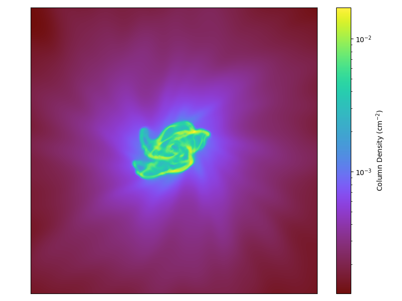
Off-Axis Projection with a Colorbar (an alternate method)
This recipe shows how to generate a colorbar with a projection of a dataset from an arbitrary projection angle (so you are not confined to the x, y, and z axes).
This uses alternate machinery than the standard PlotWindow interface to create an off-axis projection as demonstrated in this recipe.
(offaxis_projection_colorbar.py)
import yt

fn = "IsolatedGalaxy/galaxy0030/galaxy0030"  # dataset to load

ds = yt.load(fn)  # load data

# Now we need a center of our volume to render.  Here we'll just use
# 0.5,0.5,0.5, because volume renderings are not periodic.
c = [0.5, 0.5, 0.5]

# Our image plane will be normal to some vector.  For things like collapsing
# objects, you could set it the way you would a cutting plane -- but for this
# dataset, we'll just choose an off-axis value at random.  This gets normalized
# automatically.
L = [0.5, 0.4, 0.7]

# Our "width" is the width of the image plane as well as the depth.
# The first element is the left to right width, the second is the
# top-bottom width, and the last element is the back-to-front width
# (all in code units)
W = [0.04, 0.04, 0.4]

# The number of pixels along one side of the image.
# The final image will have Npixel^2 pixels.
Npixels = 512

# Now we call the off_axis_projection function, which handles the rest.
# Note that we set no_ghost equal to False, so that we *do* include ghost
# zones in our data.  This takes longer to calculate, but the results look
# much cleaner than when you ignore the ghost zones.
# Also note that we set the field which we want to project as "density", but
# really we could use any arbitrary field like "temperature", "metallicity"
# or whatever.
image = yt.off_axis_projection(ds, c, L, W, Npixels, ("gas", "density"), no_ghost=False)

# Image is now an NxN array representing the intensities of the various pixels.
# And now, we call our direct image saver.  We save the log of the result.
yt.write_projection(
    image,
    "offaxis_projection_colorbar.png",
    colorbar_label="Column Density (cm$^{-2}$)",
)
Thin-Slice Projections
This recipe is an example of how to project through only a given data object, in this case a thin region, and then display the result. See Projection Plots and Available Objects for more information.
import yt

# Load the dataset.
ds = yt.load("Enzo_64/DD0030/data0030")

# Make a projection that is the full width of the domain,
# but only 5 Mpc in depth.  This is done by creating a
# region object with this exact geometry and providing it
# as a data_source for the projection.

# Center on the domain center
center = ds.domain_center.copy()

# First make the left and right corner of the region based
# on the full domain.
left_corner = ds.domain_left_edge.copy()
right_corner = ds.domain_right_edge.copy()

# Now adjust the size of the region along the line of sight (x axis).
depth = ds.quan(5.0, "Mpc")
left_corner[0] = center[0] - 0.5 * depth
right_corner[0] = center[0] + 0.5 * depth

# Create the region
region = ds.box(left_corner, right_corner)

# Create a density projection and supply the region we have just created.
# Only cells within the region will be included in the projection.
# Try with another data container, like a sphere or disk.
plot = yt.ProjectionPlot(
    ds, "x", ("gas", "density"), weight_field=("gas", "density"), data_source=region
)

# Save the image with the keyword.
plot.save("Thin_Slice")
Plotting Particles Over Fluids
This recipe demonstrates how to overplot particles on top of a fluid image. See Overplotting Particle Positions for more information.
import yt

# Load the dataset.
ds = yt.load("Enzo_64/DD0043/data0043")

# Make a density projection centered on the 'm'aximum density location
# with a width of 10 Mpc..
p = yt.ProjectionPlot(ds, "y", ("gas", "density"), center="m", width=(10, "Mpc"))

# Modify the projection
# The argument specifies the region along the line of sight
# for which particles will be gathered.
# 1.0 signifies the entire domain in the line of sight
# p.annotate_particles(1.0)
# but in this case we only go 10 Mpc in depth
p.annotate_particles((10, "Mpc"))

# Save the image.
# Optionally, give a string as an argument
# to name files with a keyword.
p.save()
Plotting Grid Edges Over Fluids
This recipe demonstrates how to overplot grid boxes on top of a fluid image. Each level is represented with a different color from white (low refinement) to black (high refinement). One can change the colormap used for the grids colors by using the cmap keyword (or set it to None to get all grid edges as black). See Overplot Grids for more information.
import yt

# Load the dataset.
ds = yt.load("Enzo_64/DD0043/data0043")

# Make a density projection.
p = yt.ProjectionPlot(ds, "y", ("gas", "density"))

# Modify the projection
# The argument specifies the region along the line of sight
# for which particles will be gathered.
# 1.0 signifies the entire domain in the line of sight.
p.annotate_grids()

# Save the image.
# Optionally, give a string as an argument
# to name files with a keyword.
p.save()
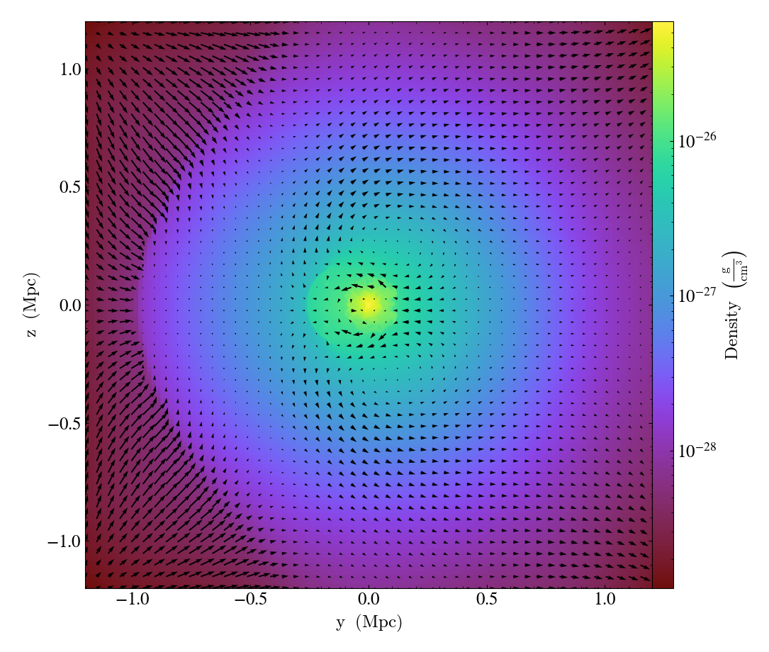
Overplotting Velocity Vectors
This recipe demonstrates how to plot velocity vectors on top of a slice. See Overplot Quivers for the Velocity Field for more information.
(velocity_vectors_on_slice.py)
import yt

# Load the dataset.
ds = yt.load("GasSloshing/sloshing_nomag2_hdf5_plt_cnt_0150")

p = yt.SlicePlot(ds, "x", ("gas", "density"))

# Draw a velocity vector every 16 pixels.
p.annotate_velocity(factor=16)
p.save()
Overplotting Contours
This is a simple recipe to show how to open a dataset, plot a slice through it, and add contours of another quantity on top. See Overplot Contours for more information.
import yt

# first add density contours on a density slice
ds = yt.load("GasSloshing/sloshing_nomag2_hdf5_plt_cnt_0150")

# add density contours on the density slice.
p = yt.SlicePlot(ds, "x", ("gas", "density"))
p.annotate_contour(("gas", "density"))
p.save()

# then add temperature contours on the same density slice
p = yt.SlicePlot(ds, "x", ("gas", "density"))
p.annotate_contour(("gas", "temperature"))
p.save(str(ds) + "_T_contour")
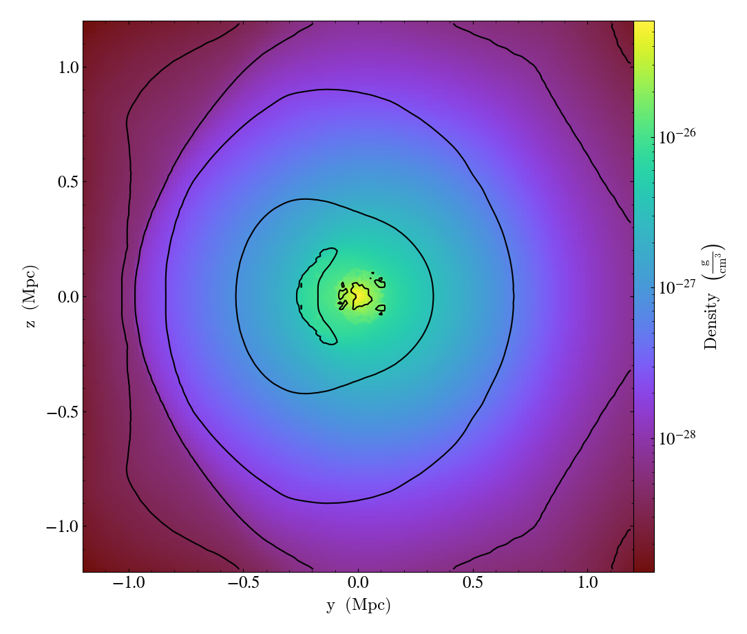
Simple Contours in a Slice
Sometimes it is useful to plot just a few contours of a quantity in a dataset. This shows how one does this by first making a slice, adding contours, and then hiding the colormap plot of the slice to leave the plot containing only the contours that one has added. See Overplot Contours for more information.
import yt

# Load the data file.
ds = yt.load("Sedov_3d/sedov_hdf5_chk_0002")

# Make a traditional slice plot.
sp = yt.SlicePlot(ds, "x", ("gas", "density"))

# Overlay the slice plot with thick red contours of density.
sp.annotate_contour(
    ("gas", "density"),
    levels=3,
    clim=(1e-2, 1e-1),
    label=True,
    plot_args={"colors": "red", "linewidths": 2},
)

# What about some nice temperature contours in blue?
sp.annotate_contour(
    ("gas", "temperature"),
    levels=3,
    clim=(1e-8, 1e-6),
    label=True,
    plot_args={"colors": "blue", "linewidths": 2},
)

# This is the plot object.
po = sp.plots["gas", "density"]

# Turn off the colormap image, leaving just the contours.
po.axes.images[0].set_visible(False)

# Remove the colorbar and its label.
po.figure.delaxes(po.figure.axes[1])

# Save it and ask for a close fit to get rid of the space used by the colorbar.
sp.save(mpl_kwargs={"bbox_inches": "tight"})
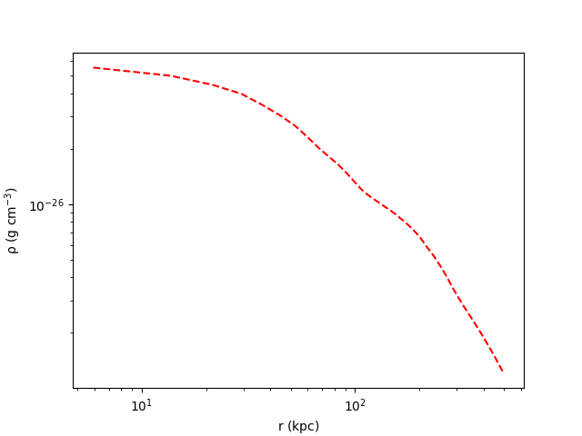
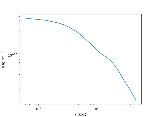
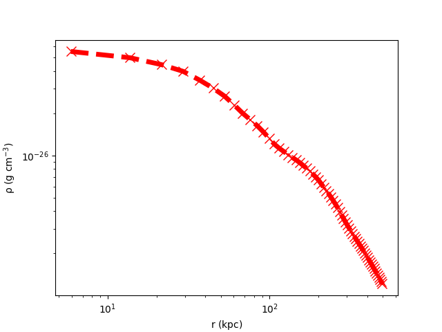
Styling Radial Profile Plots
This recipe demonstrates a method of calculating radial profiles for several quantities, styling them and saving out the resultant plot. See 1D Profile Plots for more information.
import matplotlib.pyplot as plt

import yt

ds = yt.load("GasSloshing/sloshing_nomag2_hdf5_plt_cnt_0150")

# Get a sphere object

sp = ds.sphere(ds.domain_center, (500.0, "kpc"))

# Bin up the data from the sphere into a radial profile

rp = yt.create_profile(
    sp,
    "radius",
    [("gas", "density"), ("gas", "temperature")],
    units={"radius": "kpc"},
    logs={"radius": False},
)

# Make plots using matplotlib

fig = plt.figure()
ax = fig.add_subplot(111)

# Plot the density as a log-log plot using the default settings
dens_plot = ax.loglog(rp.x.value, rp["gas", "density"].value)

# Here we set the labels of the plot axes

ax.set_xlabel(r"$\mathrm{r\ (kpc)}$")
ax.set_ylabel(r"$\mathrm{\rho\ (g\ cm^{-3})}$")

# Save the default plot

fig.savefig("density_profile_default.png" % ds)

# The "dens_plot" object is a list of plot objects. In our case we only have one,
# so we index the list by '0' to get it.

# Plot using dashed red lines

dens_plot[0].set_linestyle("--")
dens_plot[0].set_color("red")

fig.savefig("density_profile_dashed_red.png")

# Increase the line width and add points in the shape of x's

dens_plot[0].set_linewidth(5)
dens_plot[0].set_marker("x")
dens_plot[0].set_markersize(10)

fig.savefig("density_profile_thick_with_xs.png")
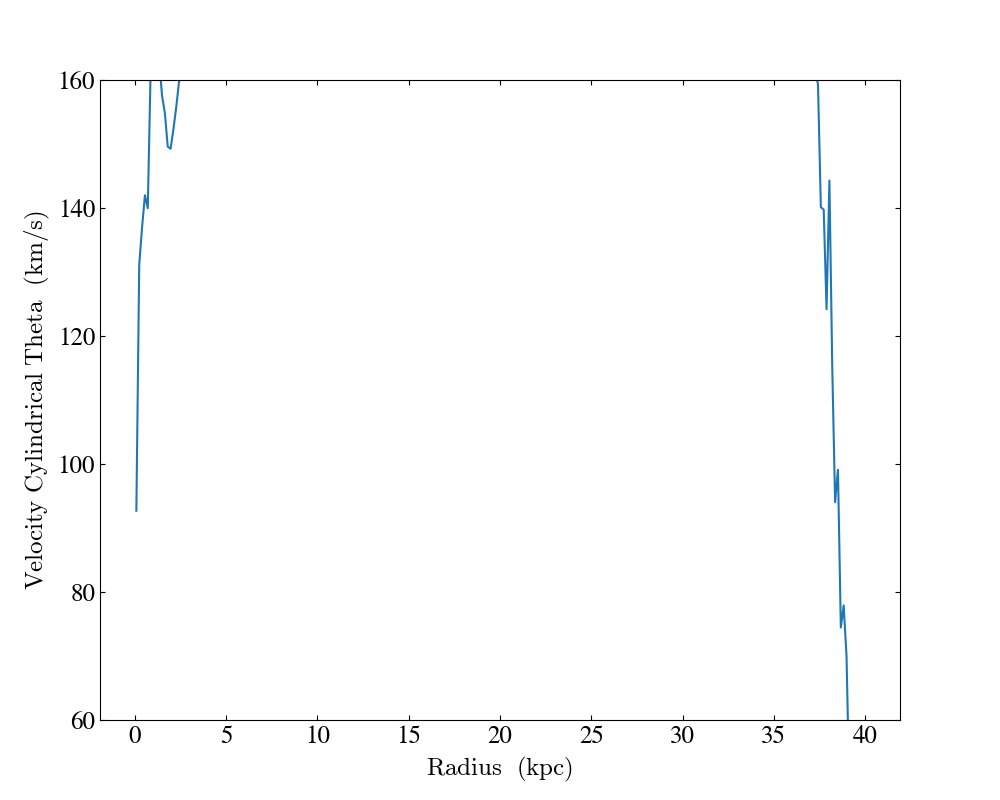
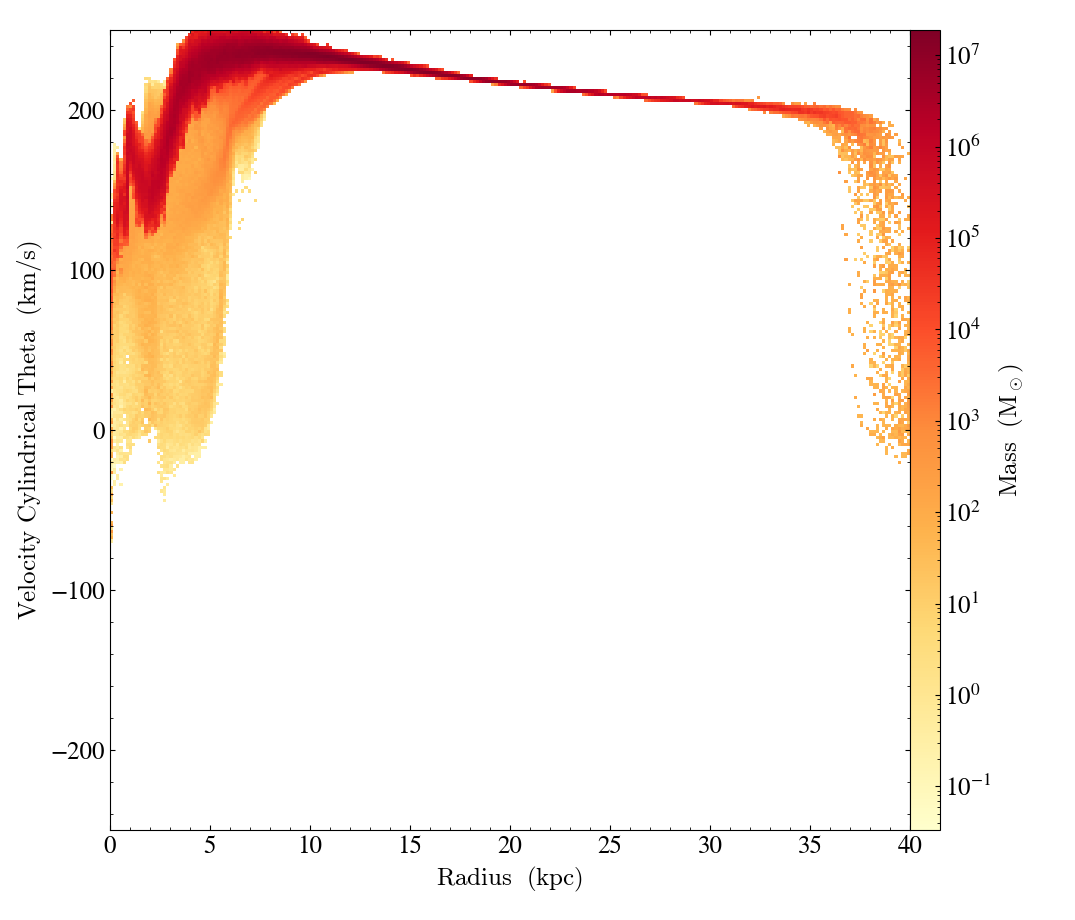
Customized Profile Plot
This recipe demonstrates how to create a fully customized 1D profile object
using the create_profile() function and then
create a ProfilePlot using the
customized profile. This illustrates how a ProfilePlot created this way
inherits the properties of the profile it is constructed from.
See 1D Profile Plots for more information.
import yt
import yt.units as u

ds = yt.load("HiresIsolatedGalaxy/DD0044/DD0044")

center = [0.53, 0.53, 0.53]
normal = [0, 0, 1]
radius = 40 * u.kpc
height = 5 * u.kpc

disk = ds.disk(center, [0, 0, 1], radius, height)

profile = yt.create_profile(
    data_source=disk,
    bin_fields=[("index", "radius")],
    fields=[("gas", "velocity_cylindrical_theta")],
    n_bins=256,
    units=dict(radius="kpc", velocity_cylindrical_theta="km/s"),
    logs=dict(radius=False),
    weight_field=("gas", "mass"),
    extrema=dict(radius=(0, 40)),
)

plot = yt.ProfilePlot.from_profiles(profile)

plot.set_log(("gas", "velocity_cylindrical_theta"), False)
plot.set_ylim(("gas", "velocity_cylindrical_theta"), 60, 160)

plot.save()
Customized Phase Plot
Similar to the recipe above, this demonstrates how to create a fully customized
2D profile object using the create_profile()
function and then create a PhasePlot
using the customized profile object. This illustrates how a PhasePlot
created this way inherits the properties of the profile object from which it
is constructed. See 2D Phase Plots for more information.
import yt
import yt.units as u

ds = yt.load("HiresIsolatedGalaxy/DD0044/DD0044")

center = [0.53, 0.53, 0.53]
normal = [0, 0, 1]
radius = 40 * u.kpc
height = 2 * u.kpc

disk = ds.disk(center, [0, 0, 1], radius, height)

profile = yt.create_profile(
    data_source=disk,
    bin_fields=[("index", "radius"), ("gas", "velocity_cylindrical_theta")],
    fields=[("gas", "mass")],
    n_bins=256,
    units=dict(radius="kpc", velocity_cylindrical_theta="km/s", mass="Msun"),
    logs=dict(radius=False, velocity_cylindrical_theta=False),
    weight_field=None,
    extrema=dict(radius=(0, 40), velocity_cylindrical_theta=(-250, 250)),
)

plot = yt.PhasePlot.from_profile(profile)
plot.set_cmap(("gas", "mass"), "YlOrRd")

plot.save()
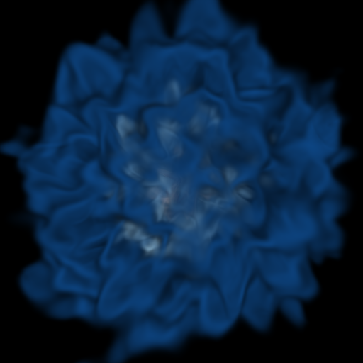
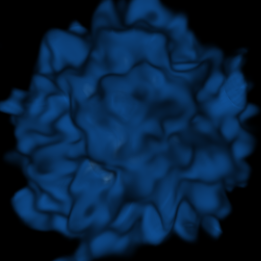
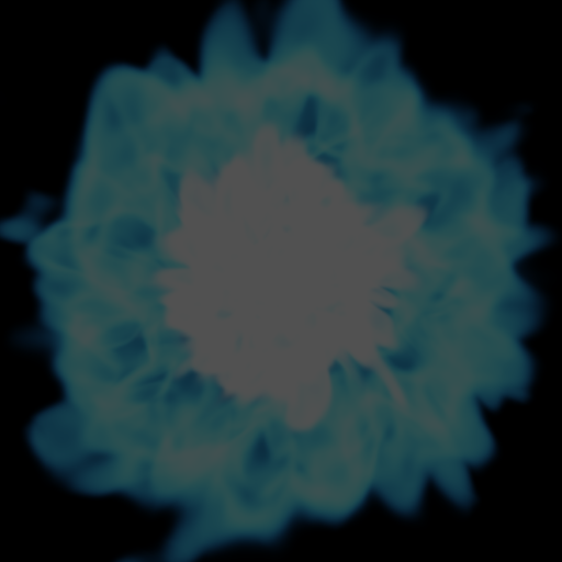
Moving a Volume Rendering Camera
In this recipe, we move a camera through a domain and take multiple volume rendering snapshots. This recipe uses an unstructured mesh dataset (see Unstructured Mesh Rendering), which makes it easier to visualize what the Camera is doing, but you can manipulate the Camera for other dataset types in exactly the same manner.
See Moving and Orienting the Camera for more information.
import numpy as np

import yt

ds = yt.load("MOOSE_sample_data/out.e-s010")
sc = yt.create_scene(ds)
cam = sc.camera

# save an image at the starting position
frame = 0
sc.save("camera_movement_%04i.png" % frame)
frame += 1

# Zoom out by a factor of 2 over 5 frames
for _ in cam.iter_zoom(0.5, 5):
    sc.save("camera_movement_%04i.png" % frame)
    frame += 1

# Move to the position [-10.0, 10.0, -10.0] over 5 frames
pos = ds.arr([-10.0, 10.0, -10.0], "code_length")
for _ in cam.iter_move(pos, 5):
    sc.save("camera_movement_%04i.png" % frame)
    frame += 1

# Rotate by 180 degrees over 5 frames
for _ in cam.iter_rotate(np.pi, 5):
    sc.save("camera_movement_%04i.png" % frame)
    frame += 1

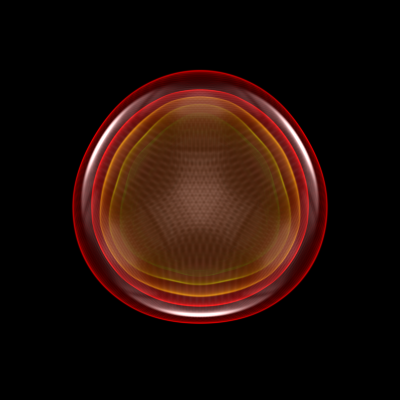
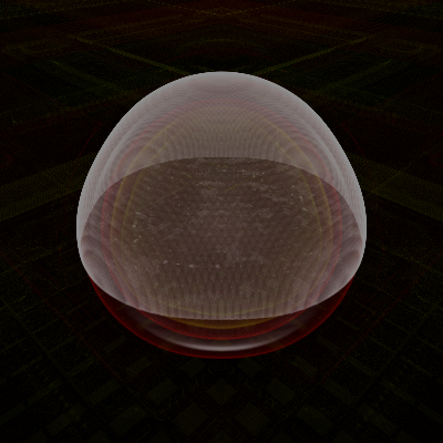
Volume Rendering with Custom Camera
In this recipe we modify the Simple Volume Rendering recipe to use customized camera properties. See 3D Visualization and Volume Rendering for more information.
(custom_camera_volume_rendering.py)
import yt

# Load the dataset
ds = yt.load("Enzo_64/DD0043/data0043")

# Create a volume rendering
sc = yt.create_scene(ds, field=("gas", "density"))

# Now increase the resolution
sc.camera.resolution = (1024, 1024)

# Set the camera focus to a position that is offset from the center of
# the domain
sc.camera.focus = ds.arr([0.3, 0.3, 0.3], "unitary")

# Move the camera position to the other side of the dataset
sc.camera.position = ds.arr([0, 0, 0], "unitary")

# save to disk with a custom filename and apply sigma clipping to eliminate
# very bright pixels, producing an image with better contrast.
sc.render()
sc.save("custom.png", sigma_clip=4)
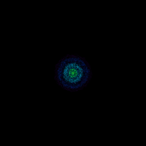
Volume Rendering with a Custom Transfer Function
In this recipe we modify the Simple Volume Rendering recipe to use customized camera properties. See 3D Visualization and Volume Rendering for more information.
(custom_transfer_function_volume_rendering.py)
import numpy as np

import yt

# Load the dataset
ds = yt.load("Enzo_64/DD0043/data0043")

# Create a volume rendering
sc = yt.create_scene(ds, field=("gas", "density"))

# Modify the transfer function

# First get the render source, in this case the entire domain,
# with field ('gas','density')
render_source = sc.get_source()

# Clear the transfer function
render_source.transfer_function.clear()

# Map a range of density values (in log space) to the Reds_r colormap
render_source.transfer_function.map_to_colormap(
    np.log10(ds.quan(5.0e-31, "g/cm**3")),
    np.log10(ds.quan(1.0e-29, "g/cm**3")),
    scale=30.0,
    colormap="RdBu_r",
)

sc.save("new_tf.png")
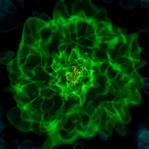
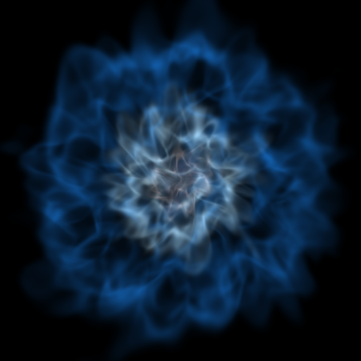
Volume Rendering with Sigma Clipping
In this recipe we output several images with different values of sigma_clip set in order to change the contrast of the resulting image. See Improving Image Contrast with Sigma Clipping for more information.
import yt

# Load the dataset.
ds = yt.load("enzo_tiny_cosmology/RD0009/RD0009")

# Create a volume rendering, which will determine data bounds, use the first
# acceptable field in the field_list, and set up a default transfer function.

# Render and save output images with different levels of sigma clipping.
# Sigma clipping removes the highest intensity pixels in a volume render,
# which affects the overall contrast of the image.
sc = yt.create_scene(ds, field=("gas", "density"))
sc.save("clip_0.png")
sc.save("clip_2.png", sigma_clip=2)
sc.save("clip_4.png", sigma_clip=4)
sc.save("clip_6.png", sigma_clip=6)
Zooming into an Image
This is a recipe that takes a slice through the most dense point, then creates a bunch of frames as it zooms in. It’s important to note that this particular recipe is provided to show how to be more flexible and add annotations and the like – the base system, of a zoomin, is provided by the “yt zoomin” command on the command line. See Slice Plots and Plot Modifications: Overplotting Contours, Velocities, Particles, and More for more information.
import numpy as np

import yt

# load data
fn = "IsolatedGalaxy/galaxy0030/galaxy0030"
ds = yt.load(fn)

# This is the number of frames to make -- below, you can see how this is used.
n_frames = 5

# This is the minimum size in smallest_dx of our last frame.
# Usually it should be set to something like 400, but for THIS
# dataset, we actually don't have that great of resolution.
min_dx = 40

frame_template = "frame_%05i"  # Template for frame filenames

p = yt.SlicePlot(ds, "z", ("gas", "density"))  # Add our slice, along z
p.annotate_contour(("gas", "temperature"))  # We'll contour in temperature

# What we do now is a bit fun.  "enumerate" returns a tuple for every item --
# the index of the item, and the item itself.  This saves us having to write
# something like "i = 0" and then inside the loop "i += 1" for ever loop.  The
# argument to enumerate is the 'logspace' function, which takes a minimum and a
# maximum and the number of items to generate.  It returns 10^power of each
# item it generates.

for i, v in enumerate(
    np.logspace(0, np.log10(ds.index.get_smallest_dx() * min_dx), n_frames)
):
    # We set our width as necessary for this frame
    p.set_width(v, "unitary")
    # save
    p.save(frame_template % (i))
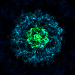
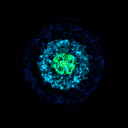
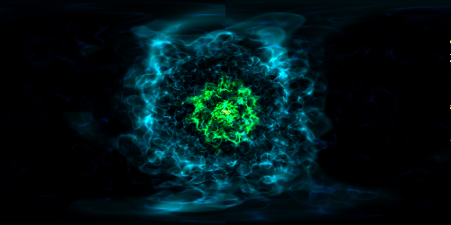
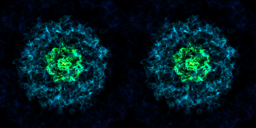
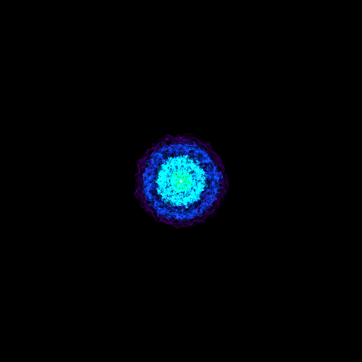
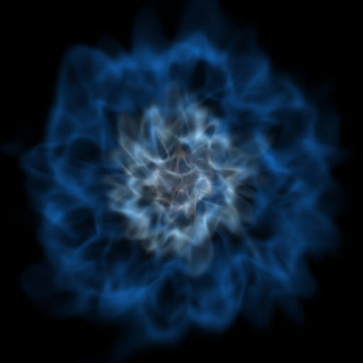
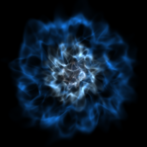
Various Lens Types for Volume Rendering
This example illustrates the usage and feature of different lenses for volume rendering.
import numpy as np
import yt
from yt.visualization.volume_rendering.api import Scene, create_volume_source
field = ("gas", "density")
# normal_vector points from camera to the center of the final projection.
# Now we look at the positive x direction.
normal_vector = [1.0, 0.0, 0.0]
# north_vector defines the "top" direction of the projection, which is
# positive z direction here.
north_vector = [0.0, 0.0, 1.0]
# Follow the simple_volume_rendering cookbook for the first part of this.
ds = yt.load("IsolatedGalaxy/galaxy0030/galaxy0030")
sc = Scene()
vol = create_volume_source(ds, field=field)
tf = vol.transfer_function
tf.grey_opacity = True
# Plane-parallel lens
cam = sc.add_camera(ds, lens_type="plane-parallel")
# Set the resolution of the final projection.
cam.resolution = [250, 250]
# Set the location of the camera to be (x=0.2, y=0.5, z=0.5)
# For plane-parallel lens, the location info along the normal_vector (here
# is x=0.2) is ignored.
cam.position = ds.arr(np.array([0.2, 0.5, 0.5]), "code_length")
# Set the orientation of the camera.
cam.switch_orientation(normal_vector=normal_vector, north_vector=north_vector)
# Set the width of the camera, where width[0] and width[1] specify the length and
# height of final projection, while width[2] in plane-parallel lens is not used.
cam.set_width(ds.domain_width * 0.5)
sc.add_source(vol)
sc.save("lens_plane-parallel.png", sigma_clip=6.0)
# Perspective lens
cam = sc.add_camera(ds, lens_type="perspective")
cam.resolution = [250, 250]
# Standing at (x=0.2, y=0.5, z=0.5), we look at the area of x>0.2 (with some open angle
# specified by camera width) along the positive x direction.
cam.position = ds.arr([0.2, 0.5, 0.5], "code_length")
cam.switch_orientation(normal_vector=normal_vector, north_vector=north_vector)
# Set the width of the camera, where width[0] and width[1] specify the length and
# height of the final projection, while width[2] specifies the distance between the
# camera and the final image.
cam.set_width(ds.domain_width * 0.5)
sc.add_source(vol)
sc.save("lens_perspective.png", sigma_clip=6.0)
# Stereo-perspective lens
cam = sc.add_camera(ds, lens_type="stereo-perspective")
# Set the size ratio of the final projection to be 2:1, since stereo-perspective lens
# will generate the final image with both left-eye and right-eye ones jointed together.
cam.resolution = [500, 250]
cam.position = ds.arr([0.2, 0.5, 0.5], "code_length")
cam.switch_orientation(normal_vector=normal_vector, north_vector=north_vector)
cam.set_width(ds.domain_width * 0.5)
# Set the distance between left-eye and right-eye.
cam.lens.disparity = ds.domain_width[0] * 1.0e-3
sc.add_source(vol)
sc.save("lens_stereo-perspective.png", sigma_clip=6.0)
# Fisheye lens
dd = ds.sphere(ds.domain_center, ds.domain_width[0] / 10)
cam = sc.add_camera(dd, lens_type="fisheye")
cam.resolution = [250, 250]
v, c = ds.find_max(field)
cam.set_position(c - 0.0005 * ds.domain_width)
cam.switch_orientation(normal_vector=normal_vector, north_vector=north_vector)
cam.set_width(ds.domain_width)
cam.lens.fov = 360.0
sc.add_source(vol)
sc.save("lens_fisheye.png", sigma_clip=6.0)
# Spherical lens
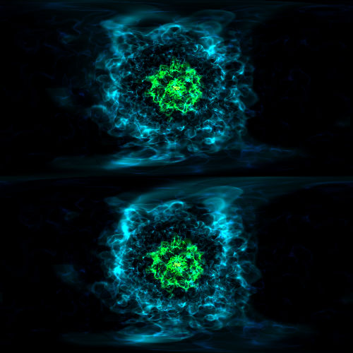
cam = sc.add_camera(ds, lens_type="spherical")
# Set the size ratio of the final projection to be 2:1, since spherical lens
# will generate the final image with length of 2*pi and height of pi.
# Recommended resolution for YouTube 360-degree videos is [3840, 2160]
cam.resolution = [500, 250]
# Standing at (x=0.4, y=0.5, z=0.5), we look in all the radial directions
# from this point in spherical coordinate.
cam.position = ds.arr([0.4, 0.5, 0.5], "code_length")
cam.switch_orientation(normal_vector=normal_vector, north_vector=north_vector)
# In (stereo)spherical camera, camera width is not used since the entire volume
# will be rendered
sc.add_source(vol)
sc.save("lens_spherical.png", sigma_clip=6.0)
# Stereo-spherical lens
cam = sc.add_camera(ds, lens_type="stereo-spherical")
# Set the size ratio of the final projection to be 1:1, since spherical-perspective lens
# will generate the final image with both left-eye and right-eye ones jointed together,
# with left-eye image on top and right-eye image on bottom.
# Recommended resolution for YouTube virtual reality videos is [3840, 2160]
cam.resolution = [500, 500]
cam.position = ds.arr([0.4, 0.5, 0.5], "code_length")
cam.switch_orientation(normal_vector=normal_vector, north_vector=north_vector)
# In (stereo)spherical camera, camera width is not used since the entire volume
# will be rendered
# Set the distance between left-eye and right-eye.
cam.lens.disparity = ds.domain_width[0] * 1.0e-3
sc.add_source(vol)
sc.save("lens_stereo-spherical.png", sigma_clip=6.0)
Opaque Volume Rendering
This recipe demonstrates how to make semi-opaque volume renderings, but also how to step through and try different things to identify the type of volume rendering you want. See Opacity for more information.
import numpy as np

import yt

ds = yt.load("IsolatedGalaxy/galaxy0030/galaxy0030")

# We start by building a default volume rendering scene

im, sc = yt.volume_render(ds, field=("gas", "density"), fname="v0.png", sigma_clip=6.0)

sc.camera.set_width(ds.arr(0.1, "code_length"))
tf = sc.get_source().transfer_function
tf.clear()
tf.add_layers(
    4, 0.01, col_bounds=[-27.5, -25.5], alpha=np.logspace(-3, 0, 4), colormap="RdBu_r"
)
sc.save("v1.png", sigma_clip=6.0)

# In this case, the default alphas used (np.logspace(-3,0,Nbins)) does not
# accentuate the outer regions of the galaxy. Let's start by bringing up the
# alpha values for each contour to go between 0.1 and 1.0

tf = sc.get_source().transfer_function
tf.clear()
tf.add_layers(
    4, 0.01, col_bounds=[-27.5, -25.5], alpha=np.logspace(0, 0, 4), colormap="RdBu_r"
)
sc.save("v2.png", sigma_clip=6.0)

# Now let's set the grey_opacity to True.  This should make the inner portions
# start to be obscured

tf.grey_opacity = True
sc.save("v3.png", sigma_clip=6.0)

# That looks pretty good, but let's start bumping up the opacity.

tf.clear()
tf.add_layers(
    4,
    0.01,
    col_bounds=[-27.5, -25.5],
    alpha=10.0 * np.ones(4, dtype="float64"),
    colormap="RdBu_r",
)
sc.save("v4.png", sigma_clip=6.0)

# Let's bump up again to see if we can obscure the inner contour.

tf.clear()
tf.add_layers(
    4,
    0.01,
    col_bounds=[-27.5, -25.5],
    alpha=30.0 * np.ones(4, dtype="float64"),
    colormap="RdBu_r",
)
sc.save("v5.png", sigma_clip=6.0)

# Now we are losing sight of everything.  Let's see if we can obscure the next
# layer

tf.clear()
tf.add_layers(
    4,
    0.01,
    col_bounds=[-27.5, -25.5],
    alpha=100.0 * np.ones(4, dtype="float64"),
    colormap="RdBu_r",
)
sc.save("v6.png", sigma_clip=6.0)

# That is very opaque!  Now lets go back and see what it would look like with
# grey_opacity = False

tf.grey_opacity = False
sc.save("v7.png", sigma_clip=6.0)

# That looks pretty different, but the main thing is that you can see that the
# inner contours are somewhat visible again.


Volume Rendering Multiple Fields
You can render multiple fields by adding new VolumeSource objects to the
scene for each field you want to render.
import yt
from yt.visualization.volume_rendering.api import Scene, create_volume_source

filePath = "Sedov_3d/sedov_hdf5_chk_0003"
ds = yt.load(filePath)
ds.force_periodicity()

sc = Scene()

# set up camera
cam = sc.add_camera(ds, lens_type="perspective")
cam.resolution = [400, 400]

cam.position = ds.arr([1, 1, 1], "cm")
cam.switch_orientation()

# add rendering of density field
dens = create_volume_source(ds, field=("flash", "dens"))
dens.use_ghost_zones = True
sc.add_source(dens)
sc.save("density.png", sigma_clip=6)

# add rendering of x-velocity field
vel = create_volume_source(ds, field=("flash", "velx"))
vel.use_ghost_zones = True
sc.add_source(vel)
sc.save("density_any_velocity.png", sigma_clip=6)
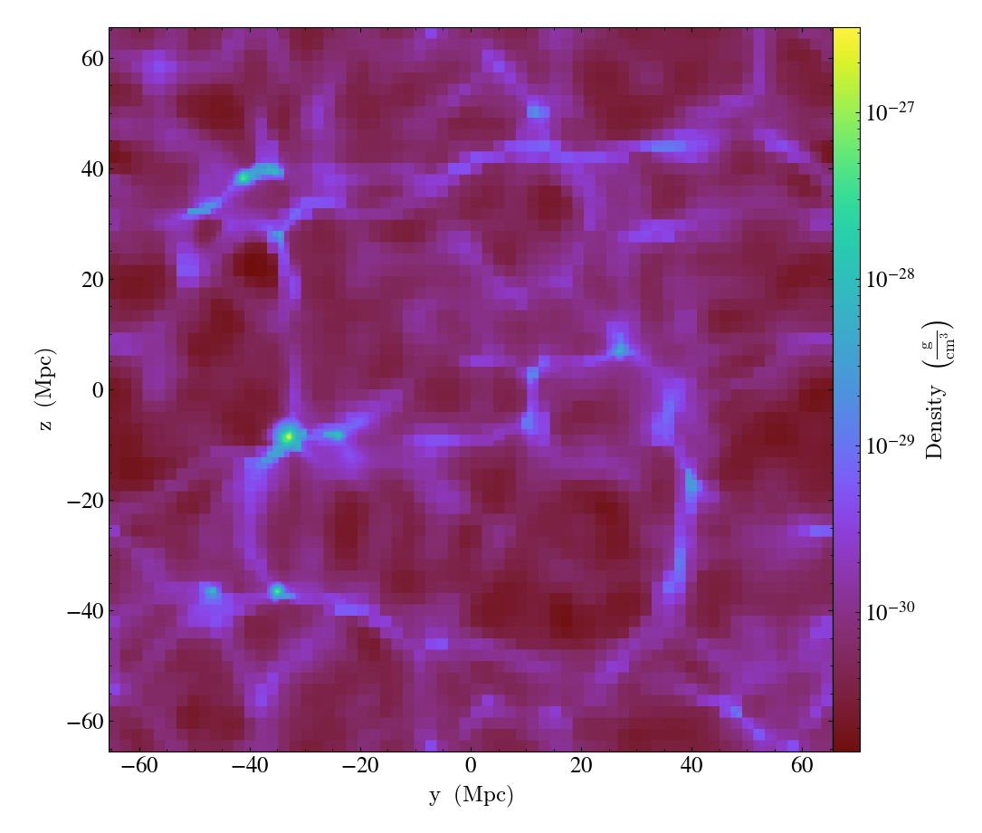
Downsampling Data for Volume Rendering
This recipe demonstrates how to downsample data in a simulation to speed up volume rendering. See 3D Visualization and Volume Rendering for more information.
# Using AMRKDTree Homogenized Volumes to examine large datasets
# at lower resolution.

# In this example we will show how to use the AMRKDTree to take a simulation
# with 8 levels of refinement and only use levels 0-3 to render the dataset.

# Currently this cookbook is flawed in that the data that is covered by the
# higher resolution data gets masked during the rendering.  This should be
# fixed by changing either the data source or the code in
# yt/utilities/amr_kdtree.py where data is being masked for the partitioned
# grid.  Right now the quick fix is to create a data_collection, but this
# will only work for patch based simulations that have ds.index.grids.

# We begin by loading up yt, and importing the AMRKDTree
import numpy as np

import yt
from yt.utilities.amr_kdtree.api import AMRKDTree

# Load up a dataset and define the kdtree
ds = yt.load("IsolatedGalaxy/galaxy0030/galaxy0030")
im, sc = yt.volume_render(ds, ("gas", "density"), fname="v0.png")
sc.camera.set_width(ds.arr(100, "kpc"))
render_source = sc.get_source()
kd = render_source.volume

# Print out specifics of KD Tree
print("Total volume of all bricks = %i" % kd.count_volume())
print("Total number of cells = %i" % kd.count_cells())

new_source = ds.all_data()
new_source.max_level = 3
kd_low_res = AMRKDTree(ds, data_source=new_source)
print(kd_low_res.count_volume())
print(kd_low_res.count_cells())

# Now we pass this in as the volume to our camera, and render the snapshot
# again.

render_source.set_volume(kd_low_res)
render_source.set_field(("gas", "density"))
sc.save("v1.png", sigma_clip=6.0)

# This operation was substantially faster.  Now lets modify the low resolution
# rendering until we find something we like.

tf = render_source.transfer_function
tf.clear()
tf.add_layers(
    4,
    0.01,
    col_bounds=[-27.5, -25.5],
    alpha=np.ones(4, dtype="float64"),
    colormap="RdBu_r",
)
sc.save("v2.png", sigma_clip=6.0)

# This looks better.  Now let's try turning on opacity.

tf.grey_opacity = True
sc.save("v3.png", sigma_clip=6.0)
#
## That seemed to pick out some interesting structures.  Now let's bump up the
## opacity.
#
tf.clear()
tf.add_layers(
    4,
    0.01,
    col_bounds=[-27.5, -25.5],
    alpha=10.0 * np.ones(4, dtype="float64"),
    colormap="RdBu_r",
)
tf.add_layers(
    4,
    0.01,
    col_bounds=[-27.5, -25.5],
    alpha=10.0 * np.ones(4, dtype="float64"),
    colormap="RdBu_r",
)
sc.save("v4.png", sigma_clip=6.0)
#
## This looks pretty good, now lets go back to the full resolution AMRKDTree
#
render_source.set_volume(kd)
sc.save("v5.png", sigma_clip=6.0)

# This looks great!


Volume Rendering with Bounding Box and Overlaid Grids
This recipe demonstrates how to overplot a bounding box on a volume rendering as well as overplotting grids representing the level of refinement achieved in different regions of the code. See Annotations for more information.
(rendering_with_box_and_grids.py)
import yt

# Load the dataset.
ds = yt.load("Enzo_64/DD0043/data0043")
sc = yt.create_scene(ds, ("gas", "density"))

# You may need to adjust the alpha values to get a rendering with good contrast
# For annotate_domain, the fourth color value is alpha.

# Draw the domain boundary
sc.annotate_domain(ds, color=[1, 1, 1, 0.01])
sc.save(f"{ds}_vr_domain.png", sigma_clip=4)

# Draw the grid boundaries
sc.annotate_grids(ds, alpha=0.01)
sc.save(f"{ds}_vr_grids.png", sigma_clip=4)

# Draw a coordinate axes triad
sc.annotate_axes(alpha=0.01)
sc.save(f"{ds}_vr_coords.png", sigma_clip=4)

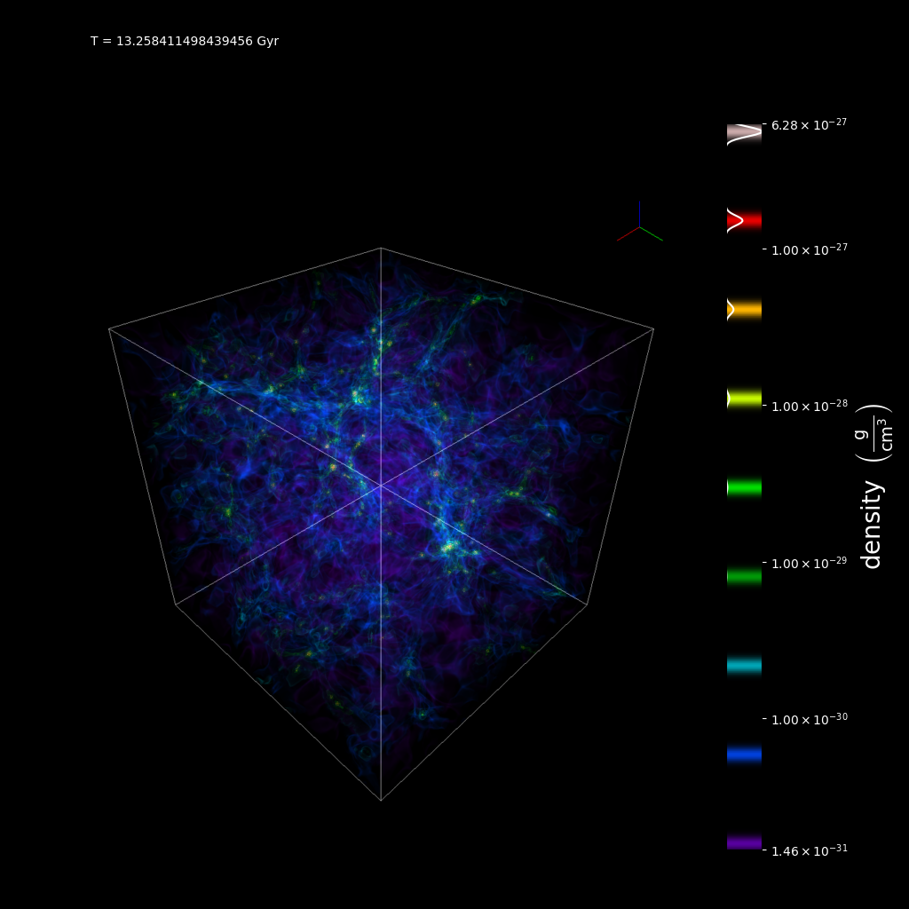
Volume Rendering with Annotation
This recipe demonstrates how to write the simulation time, show an axis triad indicating the direction of the coordinate system, and show the transfer function on a volume rendering. Please note that this recipe relies on the old volume rendering interface. While one can continue to use this interface, it may be incompatible with some of the new developments and the infrastructure described in 3D Visualization and Volume Rendering.
import yt

ds = yt.load("Enzo_64/DD0043/data0043")

sc = yt.create_scene(ds, lens_type="perspective")

source = sc[0]

source.set_field(("gas", "density"))
source.set_log(True)

# Set up the camera parameters: focus, width, resolution, and image orientation
sc.camera.focus = ds.domain_center
sc.camera.resolution = 1024
sc.camera.north_vector = [0, 0, 1]
sc.camera.position = [1.7, 1.7, 1.7]

# You may need to adjust the alpha values to get an image with good contrast.
# For the annotate_domain call, the fourth value in the color tuple is the
# alpha value.
sc.annotate_axes(alpha=0.02)
sc.annotate_domain(ds, color=[1, 1, 1, 0.01])

text_string = f"T = {float(ds.current_time.to('Gyr'))} Gyr"

# save an annotated version of the volume rendering including a representation
# of the transfer function and a nice label showing the simulation time.
sc.save_annotated(
    "vol_annotated.png", sigma_clip=6, text_annotate=[[(0.1, 0.95), text_string]]
)
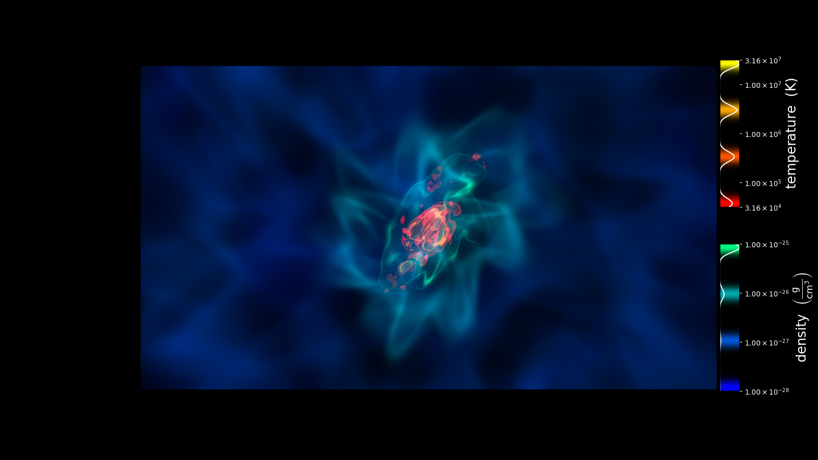
Volume Rendering Multiple Fields And Annotation
This recipe shows how to display the transfer functions when rendering multiple fields in a volume render.
import numpy as np

import yt
from yt.visualization.volume_rendering.api import Scene, create_volume_source

ds = yt.load("IsolatedGalaxy/galaxy0030/galaxy0030")

# create a scene and add volume sources to it

sc = Scene()

# Add density

field = "density"

vol = create_volume_source(ds, field=field)
vol.use_ghost_zones = True

tf = yt.ColorTransferFunction([-28, -25])
tf.clear()
tf.add_layers(4, 0.02, alpha=np.logspace(-3, -1, 4), colormap="winter")

vol.set_transfer_function(tf)
sc.add_source(vol)

# Add temperature

field = "temperature"

vol2 = create_volume_source(ds, field=field)
vol2.use_ghost_zones = True

tf = yt.ColorTransferFunction([4.5, 7.5])
tf.clear()
tf.add_layers(4, 0.02, alpha=np.logspace(-0.2, 0, 4), colormap="autumn")

vol2.set_transfer_function(tf)
sc.add_source(vol2)

# setup the camera

cam = sc.add_camera(ds, lens_type="perspective")
cam.resolution = (1600, 900)
cam.zoom(20.0)

# Render the image.

sc.render()

sc.save_annotated(
    "render_two_fields_tf.png",
    sigma_clip=6.0,
    tf_rect=[0.88, 0.15, 0.03, 0.8],
    render=False,
)
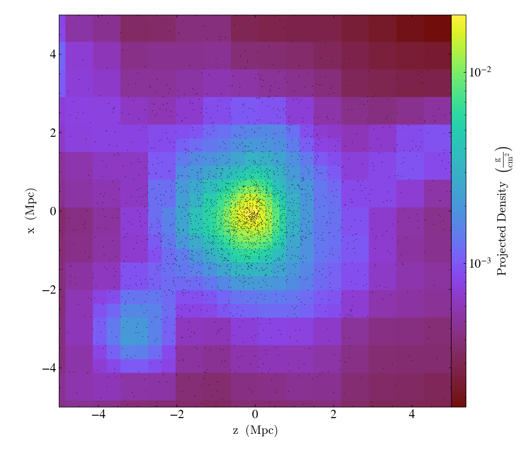
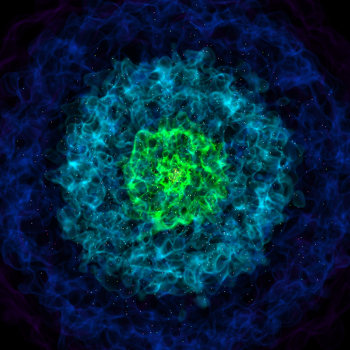
Volume Rendering with Points
This recipe demonstrates how to make a volume rendering composited with point sources. This could represent star or dark matter particles, for example.
import numpy as np

import yt
from yt.units import kpc
from yt.visualization.volume_rendering.api import PointSource

ds = yt.load("IsolatedGalaxy/galaxy0030/galaxy0030")

sc = yt.create_scene(ds)

np.random.seed(1234567)

npoints = 1000

# Random particle positions
vertices = np.random.random([npoints, 3]) * 200 * kpc

# Random colors
colors = np.random.random([npoints, 4])

# Set alpha value to something that produces a good contrast with the volume
# rendering
colors[:, 3] = 0.1

points = PointSource(vertices, colors=colors)
sc.add_source(points)

sc.camera.width = 300 * kpc

sc.save(sigma_clip=5)
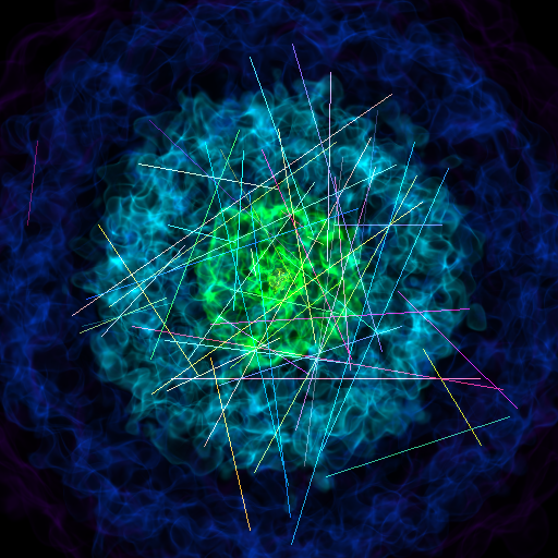
Volume Rendering with Lines
This recipe demonstrates how to make a volume rendering composited with line sources.
import numpy as np

import yt
from yt.units import kpc
from yt.visualization.volume_rendering.api import LineSource

ds = yt.load("IsolatedGalaxy/galaxy0030/galaxy0030")

sc = yt.create_scene(ds)

np.random.seed(1234567)

nlines = 50
vertices = (np.random.random([nlines, 2, 3]) - 0.5) * 200 * kpc
colors = np.random.random([nlines, 4])
colors[:, 3] = 0.1

lines = LineSource(vertices, colors)
sc.add_source(lines)

sc.camera.width = 300 * kpc

sc.save(sigma_clip=4.0)
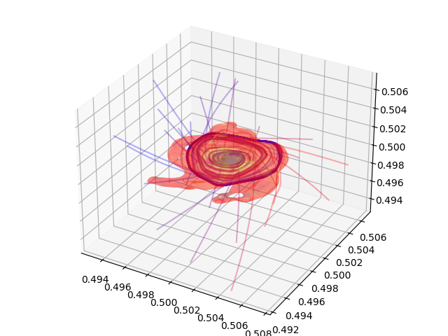
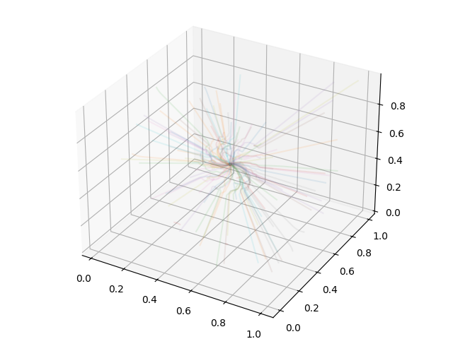
Plotting Streamlines
This recipe demonstrates how to display streamlines in a simulation. (Note: streamlines can also be queried for values!) See Streamlines: Tracking the Trajectories of Tracers in your Data for more information.
import matplotlib.pyplot as plt
import numpy as np
from mpl_toolkits.mplot3d import Axes3D

import yt
from yt.units import Mpc
from yt.visualization.api import Streamlines

# Load the dataset
ds = yt.load("IsolatedGalaxy/galaxy0030/galaxy0030")

# Define c: the center of the box, N: the number of streamlines,
# scale: the spatial scale of the streamlines relative to the boxsize,
# and then pos: the random positions of the streamlines.
c = ds.domain_center
N = 100
scale = ds.domain_width[0]
pos_dx = np.random.random((N, 3)) * scale - scale / 2.0
pos = c + pos_dx

# Create streamlines of the 3D vector velocity and integrate them through
# the box defined above
streamlines = Streamlines(
    ds,
    pos,
    ("gas", "velocity_x"),
    ("gas", "velocity_y"),
    ("gas", "velocity_z"),
    length=1.0 * Mpc,
    get_magnitude=True,
)
streamlines.integrate_through_volume()

# Create a 3D plot, trace the streamlines through the 3D volume of the plot
fig = plt.figure()
ax = Axes3D(fig, auto_add_to_figure=False)
fig.add_axes(ax)

for stream in streamlines.streamlines:
    stream = stream[np.all(stream != 0.0, axis=1)]
    ax.plot3D(stream[:, 0], stream[:, 1], stream[:, 2], alpha=0.1)

# Save the plot to disk.
plt.savefig("streamlines.png")
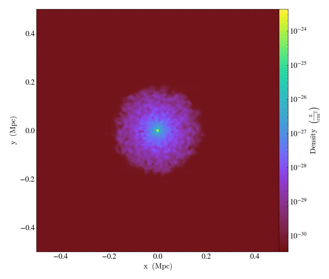
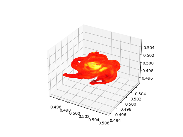
Plotting Isocontours
This recipe demonstrates how to extract an isocontour and then plot it in matplotlib, coloring the surface by a second quantity. See 3D Surfaces and Sketchfab for more information.
import matplotlib.pyplot as plt
import numpy as np
from mpl_toolkits.mplot3d import Axes3D  # noqa: F401
from mpl_toolkits.mplot3d.art3d import Poly3DCollection

import yt

# Load the dataset
ds = yt.load("IsolatedGalaxy/galaxy0030/galaxy0030")

# Create a sphere object centered on the highest density point in the simulation
# with radius 1 Mpc
sphere = ds.sphere("max", (1.0, "Mpc"))

# Identify the isodensity surface in this sphere with density = 1e-24 g/cm^3
surface = ds.surface(sphere, ("gas", "density"), 1e-24)

# Color this isodensity surface according to the log of the temperature field
colors = yt.apply_colormap(np.log10(surface["gas", "temperature"]), cmap_name="hot")

# Create a 3D matplotlib figure for visualizing the surface
fig = plt.figure()
ax = fig.add_subplot(projection="3d")
p3dc = Poly3DCollection(surface.triangles, linewidth=0.0)

# Set the surface colors in the right scaling [0,1]
p3dc.set_facecolors(colors[0, :, :] / 255.0)
ax.add_collection(p3dc)

# Let's keep the axis ratio fixed in all directions by taking the maximum
# extent in one dimension and make it the bounds in all dimensions
max_extent = (surface.vertices.max(axis=1) - surface.vertices.min(axis=1)).max()
centers = (surface.vertices.max(axis=1) + surface.vertices.min(axis=1)) / 2
bounds = np.zeros([3, 2])
bounds[:, 0] = centers[:] - max_extent / 2
bounds[:, 1] = centers[:] + max_extent / 2
ax.auto_scale_xyz(bounds[0, :], bounds[1, :], bounds[2, :])

# Save the figure
plt.savefig(f"{ds}_Surface.png")
Plotting Isocontours and Streamlines
This recipe plots both isocontours and streamlines simultaneously. Note that this will not include any blending, so streamlines that are occluded by the surface will still be visible. See Streamlines: Tracking the Trajectories of Tracers in your Data and 3D Surfaces and Sketchfab for more information.
import matplotlib.pyplot as plt
import numpy as np
from mpl_toolkits.mplot3d import Axes3D
from mpl_toolkits.mplot3d.art3d import Poly3DCollection

import yt
from yt.visualization.api import Streamlines

# Load the dataset
ds = yt.load("IsolatedGalaxy/galaxy0030/galaxy0030")

# Define c: the center of the box, N: the number of streamlines,
# scale: the spatial scale of the streamlines relative to the boxsize,
# and then pos: the random positions of the streamlines.
c = ds.arr([0.5] * 3, "code_length")
N = 30
scale = ds.quan(15, "kpc").in_units("code_length")  # 15 kpc in code units
pos_dx = np.random.random((N, 3)) * scale - scale / 2.0
pos = c + pos_dx

# Create the streamlines from these positions with the velocity fields as the
# fields to be traced
streamlines = Streamlines(
    ds,
    pos,
    ("gas", "velocity_x"),
    ("gas", "velocity_y"),
    ("gas", "velocity_z"),
    length=1.0,
)
streamlines.integrate_through_volume()

# Create a 3D matplotlib figure for visualizing the streamlines
fig = plt.figure()
ax = Axes3D(fig, auto_add_to_figure=False)
fig.add_axes(ax)

# Trace the streamlines through the volume of the 3D figure
for stream in streamlines.streamlines:
    stream = stream[np.all(stream != 0.0, axis=1)]

    # Make the colors of each stream vary continuously from blue to red
    # from low-x to high-x of the stream start position (each color is R, G, B)
    # can omit and just set streamline colors to a fixed color
    x_start_pos = ds.arr(stream[0, 0], "code_length")
    x_start_pos -= ds.arr(0.5, "code_length")
    x_start_pos /= scale
    x_start_pos += 0.5
    color = np.array([x_start_pos, 0, 1 - x_start_pos])

    # Plot the stream in 3D
    ax.plot3D(stream[:, 0], stream[:, 1], stream[:, 2], alpha=0.3, color=color)

# Create a sphere object centered on the highest density point in the simulation
# with radius = 1 Mpc
sphere = ds.sphere("max", (1.0, "Mpc"))

# Identify the isodensity surface in this sphere with density = 1e-24 g/cm^3
surface = ds.surface(sphere, ("gas", "density"), 1e-24)

# Color this isodensity surface according to the log of the temperature field
colors = yt.apply_colormap(np.log10(surface["gas", "temperature"]), cmap_name="hot")

# Render this surface
p3dc = Poly3DCollection(surface.triangles, linewidth=0.0)
colors = colors[0, :, :] / 255.0  # scale to [0,1]
colors[:, 3] = 0.3  # alpha = 0.3
p3dc.set_facecolors(colors)
ax.add_collection(p3dc)

# Save the figure
plt.savefig("streamlines_isocontour.png")