Making Simple Plots
One of the easiest ways to interact with yt is by creating simple visualizations of your data. Below we show how to do this, as well as how to extend these plots to be ready for publication.
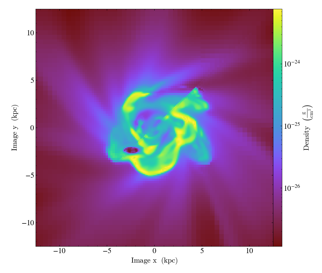
Simple Slices
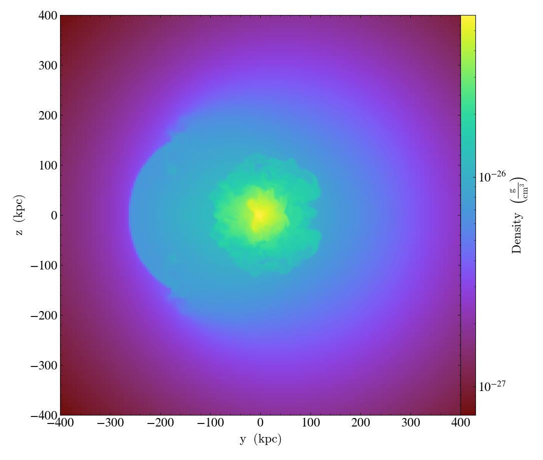
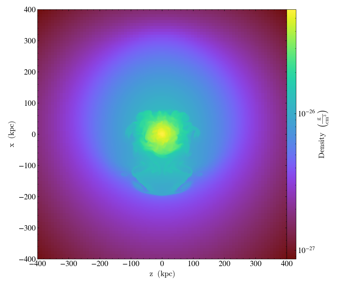
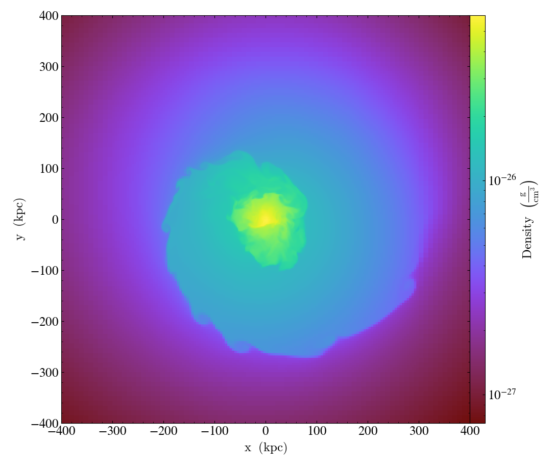
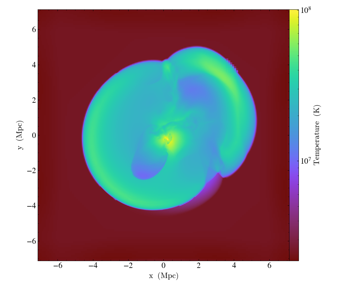
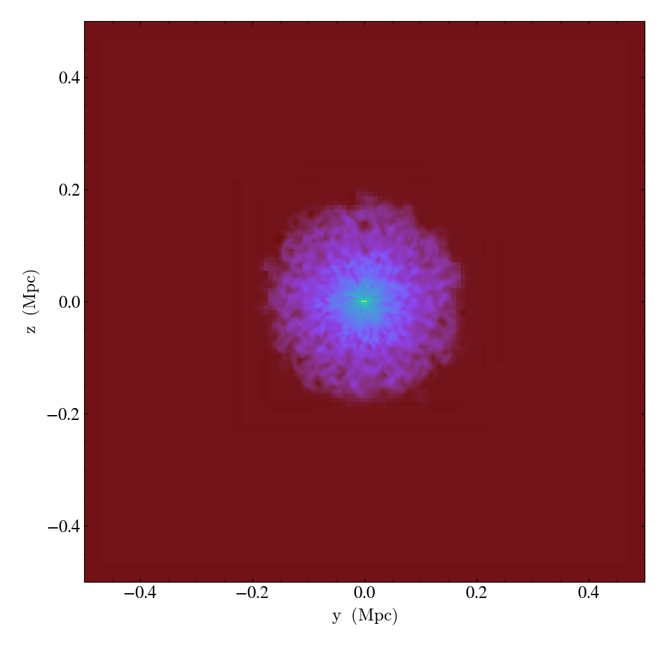
This script shows the simplest way to make a slice through a dataset. See Slice Plots for more information.
import yt

# Load the dataset.
ds = yt.load("GasSloshing/sloshing_nomag2_hdf5_plt_cnt_0150")

# Create gas density slices in all three axes.
yt.SlicePlot(ds, "x", ("gas", "density"), width=(800.0, "kpc")).save()
yt.SlicePlot(ds, "y", ("gas", "density"), width=(800.0, "kpc")).save()
yt.SlicePlot(ds, "z", ("gas", "density"), width=(800.0, "kpc")).save()
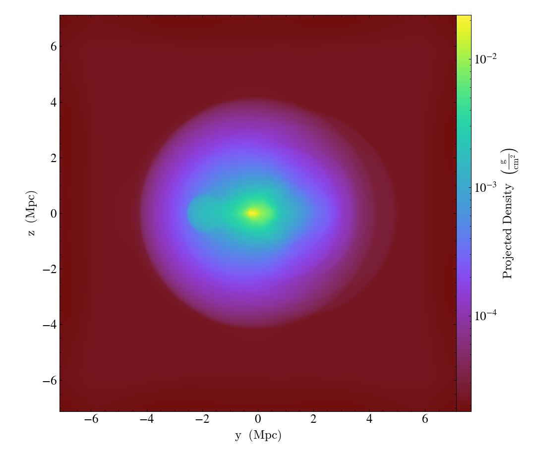
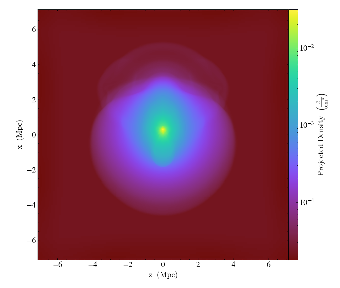
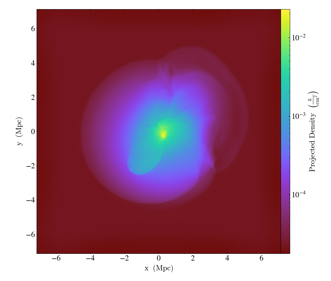
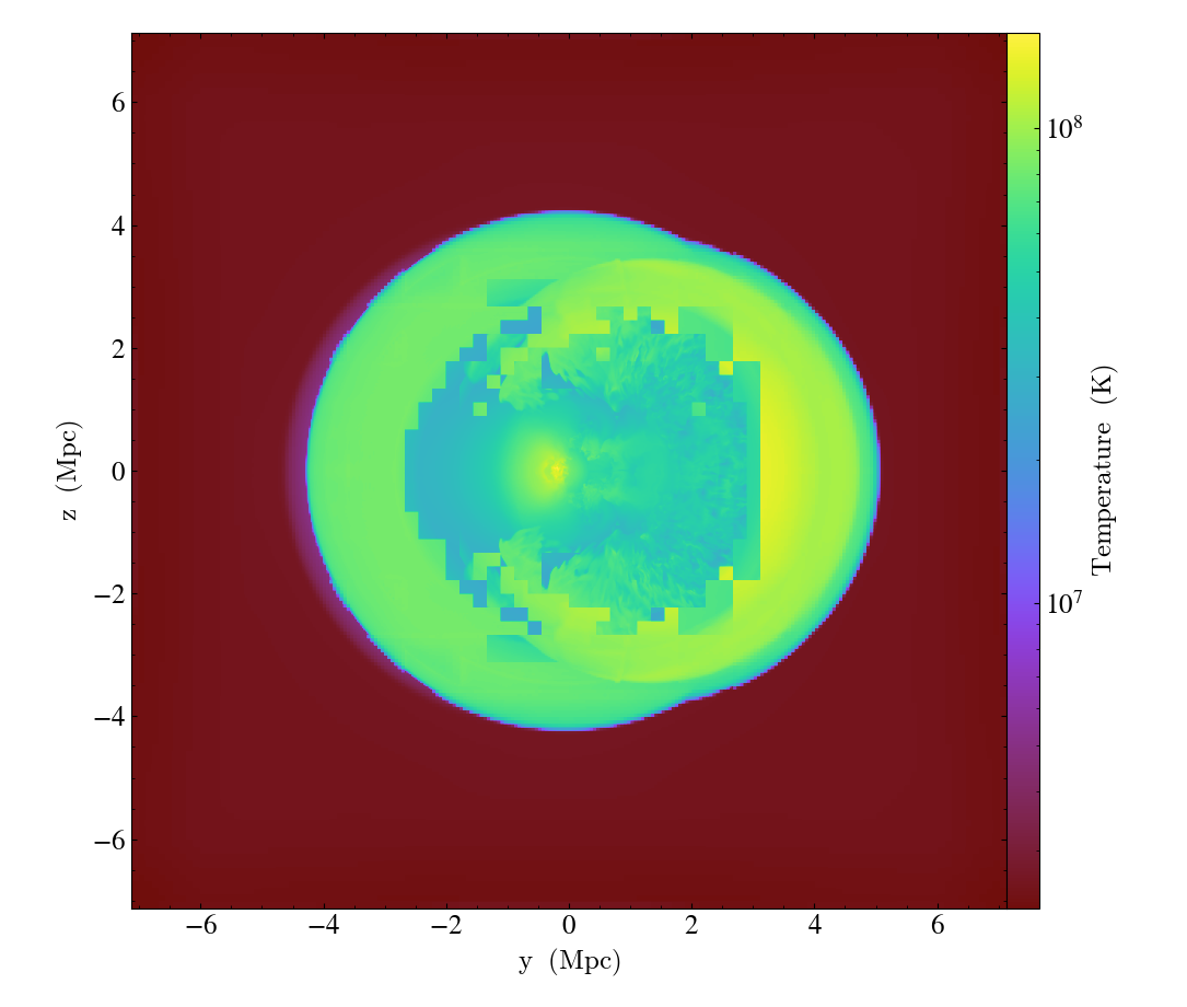
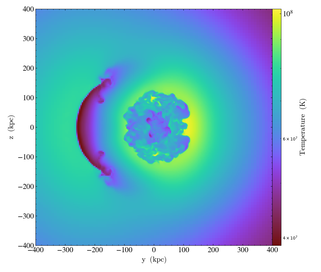
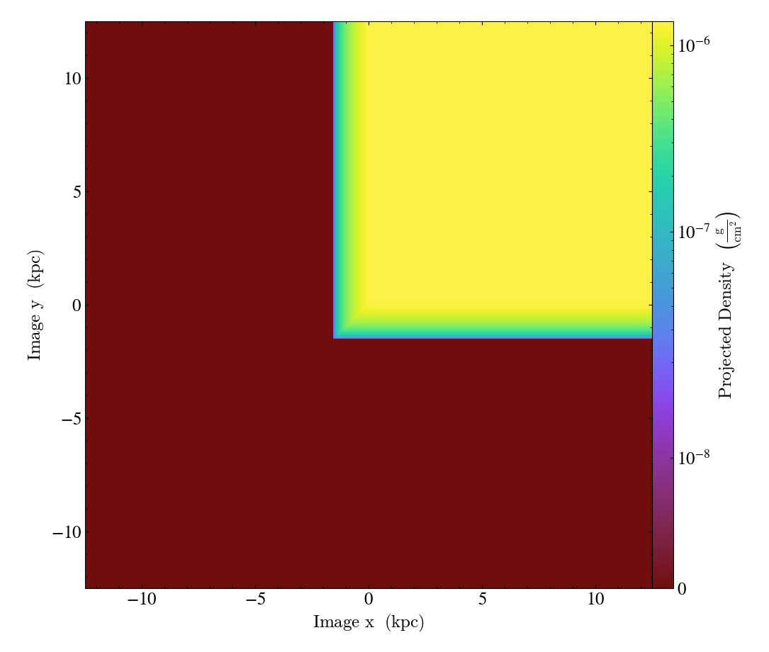
Simple Projections (Non-Weighted)
This is the simplest way to make a projection through a dataset. There are several different Types of Projections, but non-weighted line integrals and weighted line integrals are the two most common. Here we create density projections (non-weighted line integral). See Projection Plots for more information.
import yt

# Load the dataset.
ds = yt.load("GalaxyClusterMerger/fiducial_1to3_b0.273d_hdf5_plt_cnt_0175")

# Create projections of the gas density (non-weighted line integrals).

yt.ProjectionPlot(ds, "x", ("gas", "density")).save()
yt.ProjectionPlot(ds, "y", ("gas", "density")).save()
yt.ProjectionPlot(ds, "z", ("gas", "density")).save()
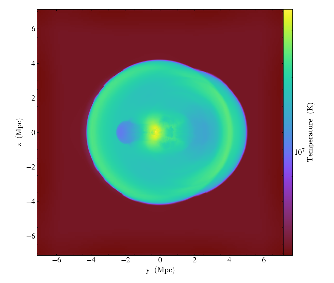
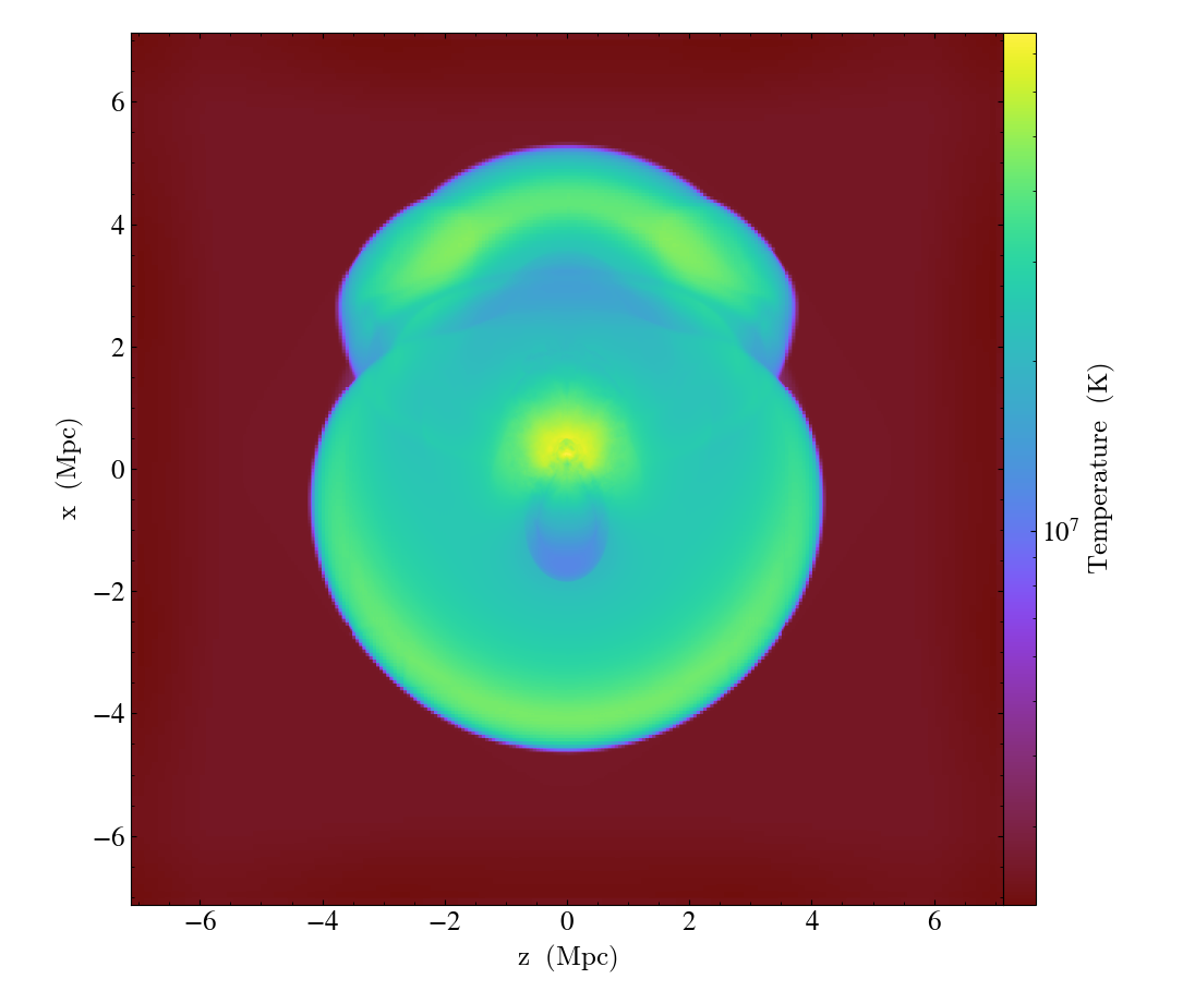
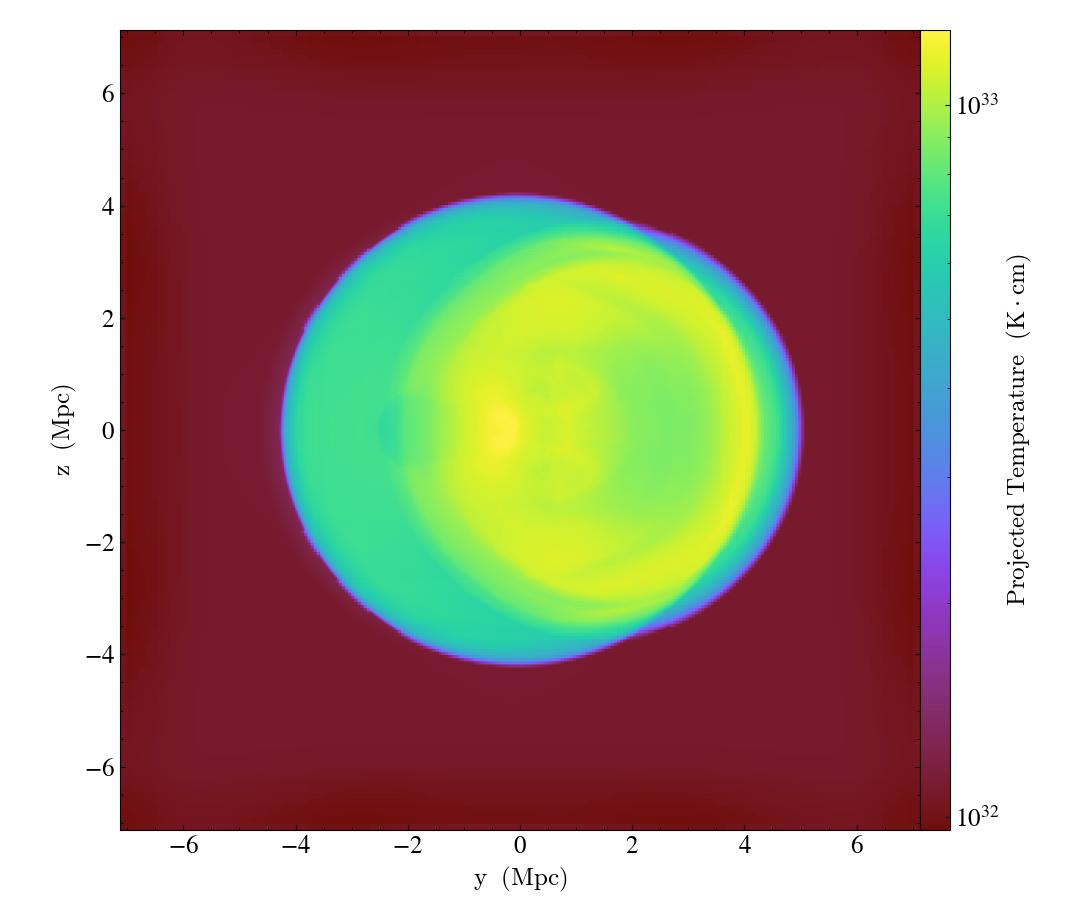
Simple Projections (Weighted)
And here we produce density-weighted temperature projections (weighted line integral) for the same dataset as the non-weighted projections above. See Projection Plots for more information.
(simple_projection_weighted.py)
import yt

# Load the dataset.
ds = yt.load("GalaxyClusterMerger/fiducial_1to3_b0.273d_hdf5_plt_cnt_0175")

# Create density-weighted projections of temperature (weighted line integrals)

for normal in "xyz":
    yt.ProjectionPlot(
        ds, normal, ("gas", "temperature"), weight_field=("gas", "density")
    ).save()
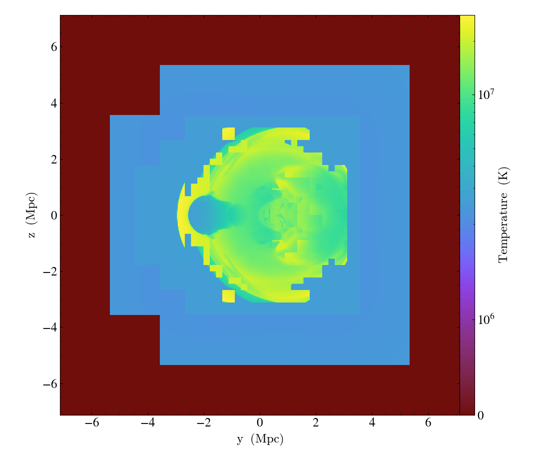
Simple Projections (Methods)
And here we illustrate different methods for projection plots (integrate, minimum, maximum).
(simple_projection_methods.py)
import yt

# Load the dataset.
ds = yt.load("GalaxyClusterMerger/fiducial_1to3_b0.273d_hdf5_plt_cnt_0175")

# Create projections of temperature (with different methods)


for method in ["integrate", "min", "max"]:
    proj = yt.ProjectionPlot(ds, "x", ("gas", "temperature"), method=method)
    proj.save(f"projection_method_{method}.png")
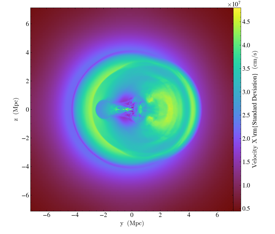
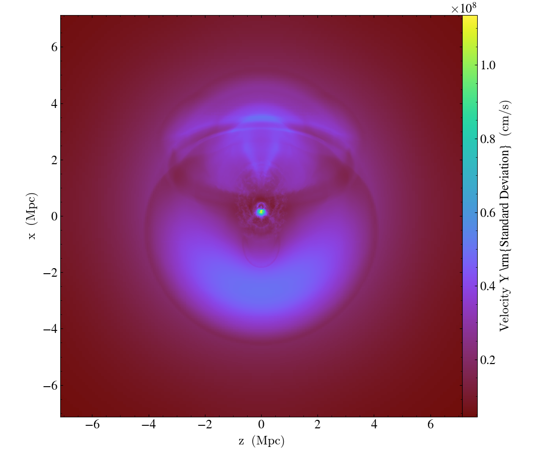
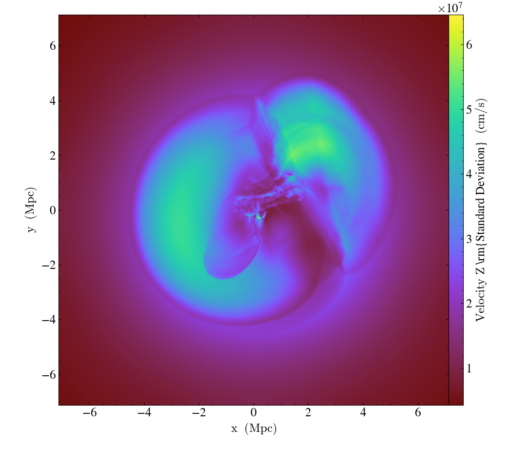
Simple Projections (Weighted Standard Deviation)
And here we produce a density-weighted projection (weighted line integral) of the line-of-sight velocity from the same dataset (see Projection Plots for more information).
import yt

# Load the dataset.
ds = yt.load("GalaxyClusterMerger/fiducial_1to3_b0.273d_hdf5_plt_cnt_0175")

# Create density-weighted projections of standard deviation of the velocity
# (weighted line integrals)

for normal in "xyz":
    yt.ProjectionPlot(
        ds,
        normal,
        ("gas", f"velocity_{normal}"),
        weight_field=("gas", "density"),
        moment=2,
    ).save()
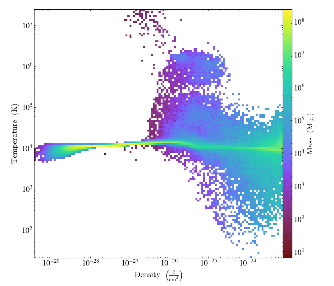
Simple Phase Plots
This demonstrates how to make a phase plot. Phase plots can be thought of as two-dimensional histograms, where the value is either the weighted-average or the total accumulation in a cell. See 2D Phase Plots for more information.
import yt

# Load the dataset.
ds = yt.load("IsolatedGalaxy/galaxy0030/galaxy0030")

# Create a sphere of radius 100 kpc in the center of the domain.
my_sphere = ds.sphere("c", (100.0, "kpc"))

# Create a PhasePlot object.
# Setting weight to None will calculate a sum.
# Setting weight to a field will calculate an average
# weighted by that field.
plot = yt.PhasePlot(
    my_sphere,
    ("gas", "density"),
    ("gas", "temperature"),
    ("gas", "mass"),
    weight_field=None,
)

# Set the units of mass to be in solar masses (not the default in cgs)
plot.set_unit(("gas", "mass"), "Msun")

# Save the image.
# Optionally, give a string as an argument
# to name files with a keyword.
plot.save()
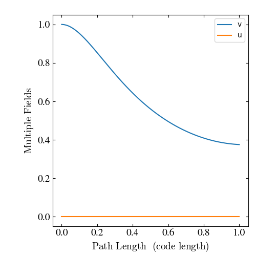
Simple 1D Line Plotting
This script shows how to make a LinePlot through a dataset.
See Line Plots for more information.
import yt

# Load the dataset
ds = yt.load("SecondOrderTris/RZ_p_no_parts_do_nothing_bcs_cone_out.e", step=-1)

# Create a line plot of the variables 'u' and 'v' with 1000 sampling points evenly
# spaced between the coordinates (0, 0, 0) and (0, 1, 0)
plot = yt.LinePlot(
    ds, [("all", "v"), ("all", "u")], (0.0, 0.0, 0.0), (0.0, 1.0, 0.0), 1000
)

# Add a legend
plot.annotate_legend(("all", "v"))

# Save the line plot
plot.save()
Note
Not every data types have support for yt.LinePlot yet.
Currently, this operation is supported for grid based data with cartesian geometry.
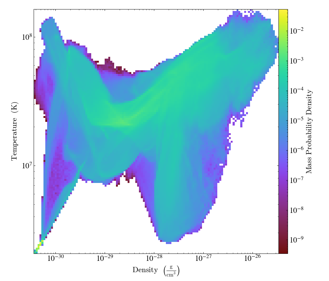
Simple Probability Distribution Functions
Often, one wants to examine the distribution of one variable as a function of another. This shows how to see the distribution of mass in a simulation, with respect to the total mass in the simulation. See 2D Phase Plots for more information.
import yt

# Load the dataset.
ds = yt.load("GalaxyClusterMerger/fiducial_1to3_b0.273d_hdf5_plt_cnt_0175")

# Create a data object that represents the whole box.
ad = ds.all_data()

# This is identical to the simple phase plot, except we supply
# the fractional=True keyword to divide the profile data by the sum.
plot = yt.PhasePlot(
    ad,
    ("gas", "density"),
    ("gas", "temperature"),
    ("gas", "mass"),
    weight_field=None,
    fractional=True,
)

# Save the image.
# Optionally, give a string as an argument
# to name files with a keyword.
plot.save()
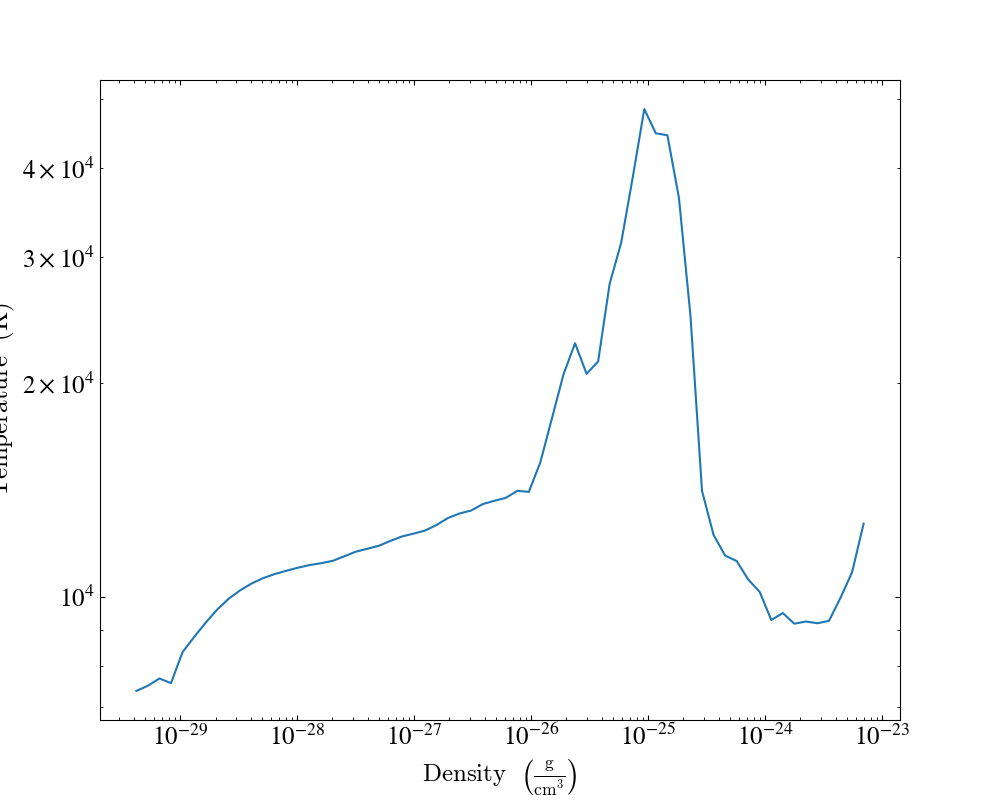
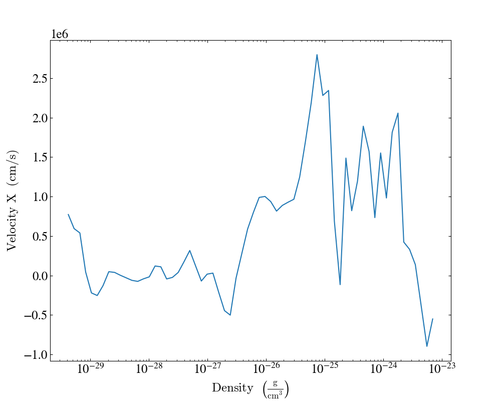
Simple 1D Histograms (Profiles)
This is a “profile,” which is a 1D histogram. This can be thought of as either
the total accumulation (when weight_field is set to None) or the average
(when a weight_field is supplied.)
See 1D Profile Plots for more information.
import yt

# Load the dataset.
ds = yt.load("IsolatedGalaxy/galaxy0030/galaxy0030")

# Create a 1D profile within a sphere of radius 100 kpc
# of the average temperature and average velocity_x
# vs. density, weighted by mass.
sphere = ds.sphere("c", (100.0, "kpc"))
plot = yt.ProfilePlot(
    sphere,
    ("gas", "density"),
    [("gas", "temperature"), ("gas", "velocity_x")],
    weight_field=("gas", "mass"),
)
plot.set_log(("gas", "velocity_x"), False)

# Save the image.
# Optionally, give a string as an argument
# to name files with a keyword.
plot.save()
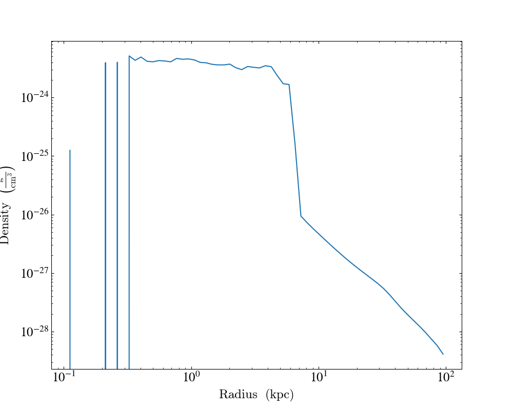
Simple Radial Profiles
This shows how to make a profile of a quantity with respect to the radius. See 1D Profile Plots for more information.
import yt

# Load the dataset.
ds = yt.load("IsolatedGalaxy/galaxy0030/galaxy0030")

# Create a sphere of radius 100 kpc in the center of the box.
my_sphere = ds.sphere("c", (100.0, "kpc"))

# Create a profile of the average density vs. radius.
plot = yt.ProfilePlot(
    my_sphere,
    ("index", "radius"),
    ("gas", "density"),
    weight_field=("gas", "mass"),
)

# Change the units of the radius into kpc (and not the default in cgs)
plot.set_unit(("index", "radius"), "kpc")

# Save the image.
# Optionally, give a string as an argument
# to name files with a keyword.
plot.save()
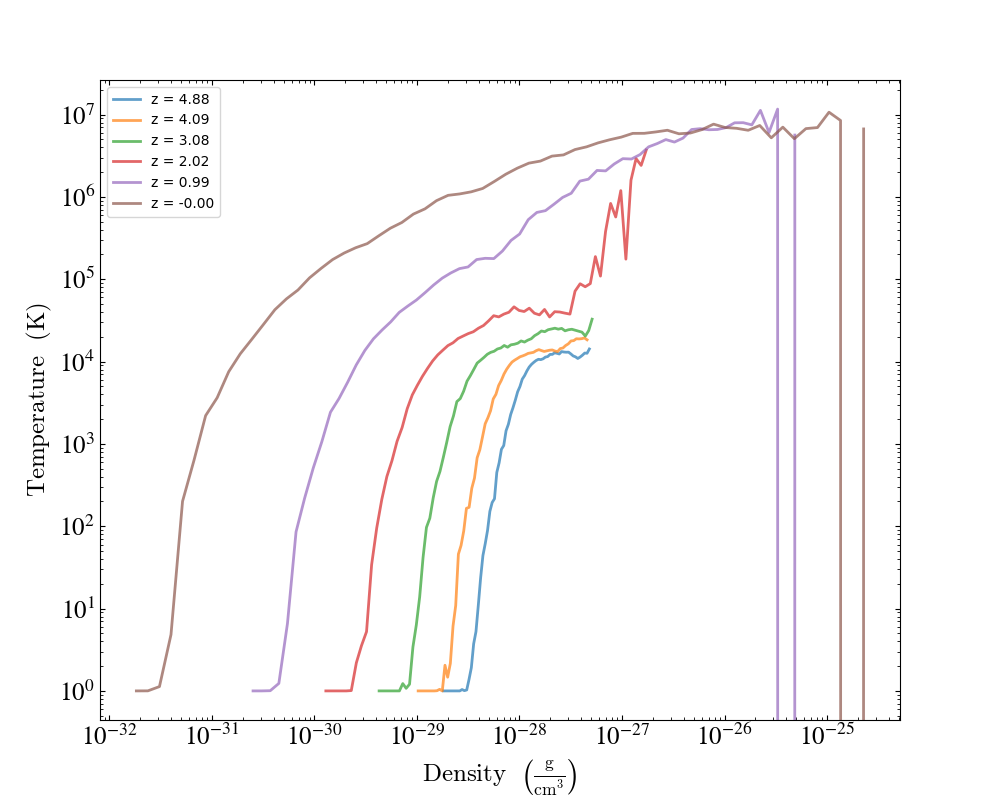
1D Profiles Over Time
This is a simple example of overplotting multiple 1D profiles from a number of datasets to show how they evolve over time. See 1D Profile Plots for more information.
import yt

# Create a time-series object.
sim = yt.load_simulation("enzo_tiny_cosmology/32Mpc_32.enzo", "Enzo")
sim.get_time_series(redshifts=[5, 4, 3, 2, 1, 0])

# Lists to hold profiles, labels, and plot specifications.
profiles = []
labels = []
plot_specs = []

# Loop over each dataset in the time-series.
for ds in sim:
    # Create a data container to hold the whole dataset.
    ad = ds.all_data()
    # Create a 1d profile of density vs. temperature.
    profiles.append(
        yt.create_profile(ad, [("gas", "density")], fields=[("gas", "temperature")])
    )
    # Add labels and linestyles.
    labels.append(f"z = {ds.current_redshift:.2f}")
    plot_specs.append(dict(linewidth=2, alpha=0.7))

# Create the profile plot from the list of profiles.
plot = yt.ProfilePlot.from_profiles(profiles, labels=labels, plot_specs=plot_specs)
# Save the image.
plot.save()
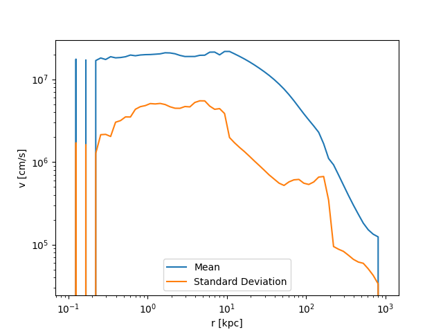
Profiles with Standard Deviation
This shows how to plot a 1D profile with error bars indicating the standard deviation of the field values in each profile bin. In this example, we manually create a 1D profile object, which gives us access to the standard deviation data. See 1D Profile Plots for more information.
(profile_with_standard_deviation.py)
import matplotlib.pyplot as plt

import yt

# Load the dataset.
ds = yt.load("IsolatedGalaxy/galaxy0030/galaxy0030")

# Create a sphere of radius 1 Mpc centered on the max density location.
sp = ds.sphere("max", (1, "Mpc"))

# Calculate and store the bulk velocity for the sphere.
bulk_velocity = sp.quantities.bulk_velocity()
sp.set_field_parameter("bulk_velocity", bulk_velocity)

# Create a 1D profile object for profiles over radius
# and add a velocity profile.
prof = yt.create_profile(
    sp,
    "radius",
    ("gas", "velocity_magnitude"),
    units={"radius": "kpc"},
    extrema={"radius": ((0.1, "kpc"), (1000.0, "kpc"))},
    weight_field=("gas", "mass"),
)

# Create arrays to plot.
radius = prof.x
mean = prof["gas", "velocity_magnitude"]
std = prof.standard_deviation["gas", "velocity_magnitude"]

# Plot the average velocity magnitude.
plt.loglog(radius, mean, label="Mean")
# Plot the standard deviation of the velocity magnitude.
plt.loglog(radius, std, label="Standard Deviation")
plt.xlabel("r [kpc]")
plt.ylabel("v [cm/s]")
plt.legend()

plt.savefig("velocity_profiles.png")
Making Plots of Multiple Fields Simultaneously
By adding multiple fields to a single
SlicePlot or
ProjectionPlot some of the overhead of
creating the data object can be reduced, and better performance squeezed out.
This recipe shows how to add multiple fields to a single plot.
See Slice Plots and Projection Plots for more information.
(simple_slice_with_multiple_fields.py)
import yt

# Load the dataset
ds = yt.load("GasSloshing/sloshing_nomag2_hdf5_plt_cnt_0150")

# Create gas density slices of several fields along the x axis simultaneously
yt.SlicePlot(
    ds,
    "x",
    [("gas", "density"), ("gas", "temperature"), ("gas", "pressure")],
    width=(800.0, "kpc"),
).save()

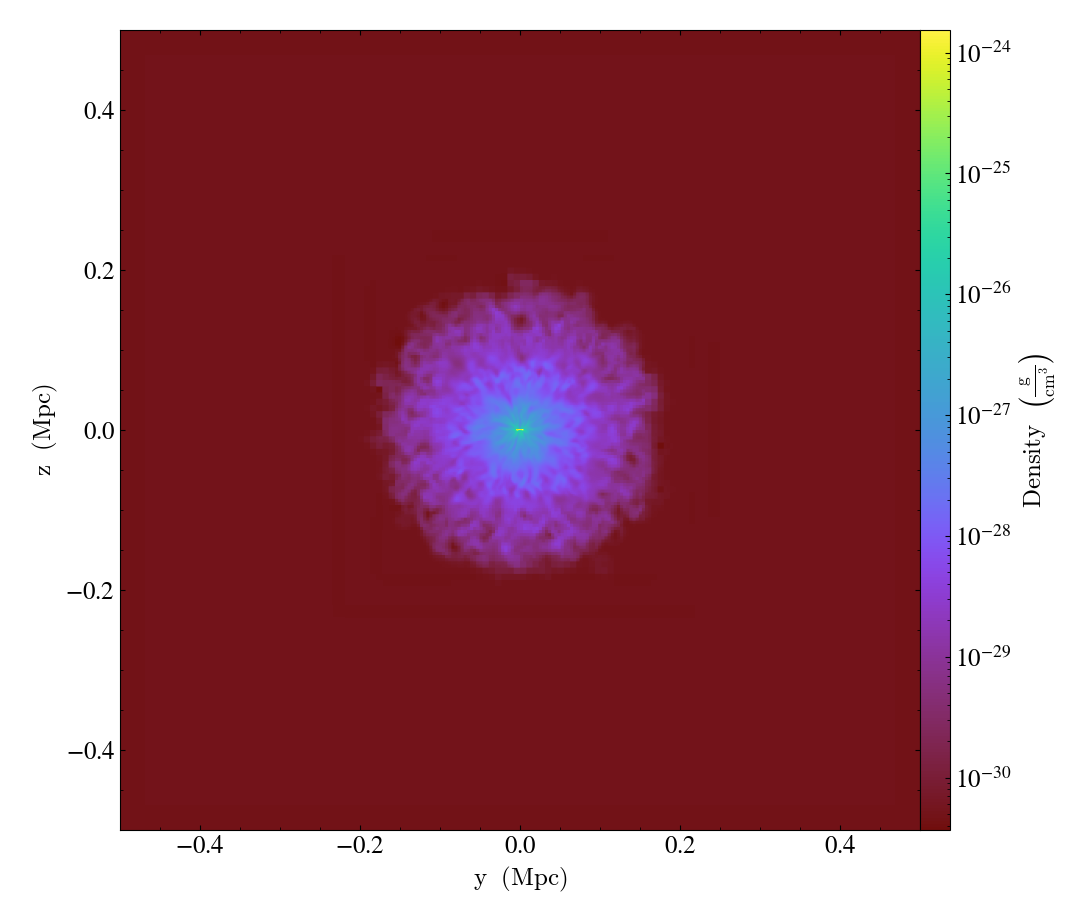
Off-Axis Slicing
One can create slices from any arbitrary angle, not just those aligned with the x,y,z axes. See Off Axis Slices for more information.
import yt

# Load the dataset.
ds = yt.load("IsolatedGalaxy/galaxy0030/galaxy0030")

# Create a 15 kpc radius sphere, centered on the center of the sim volume
sp = ds.sphere("center", (15.0, "kpc"))

# Get the angular momentum vector for the sphere.
L = sp.quantities.angular_momentum_vector()

print(f"Angular momentum vector: {L}")

# Create an OffAxisSlicePlot of density centered on the object with the L
# vector as its normal and a width of 25 kpc on a side
p = yt.OffAxisSlicePlot(ds, L, ("gas", "density"), sp.center, (25, "kpc"))
p.save()
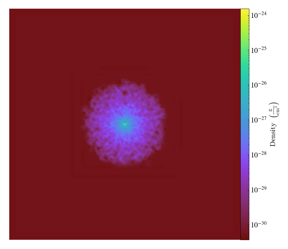
Off-Axis Projection
Like off-axis slices, off-axis projections can be created from any arbitrary viewing angle. See Off Axis Projection Plots for more information.
(simple_off_axis_projection.py)
import yt

# Load the dataset.
ds = yt.load("IsolatedGalaxy/galaxy0030/galaxy0030")

# Create a 15 kpc radius sphere, centered on the center of the sim volume
sp = ds.sphere("center", (15.0, "kpc"))

# Get the angular momentum vector for the sphere.
L = sp.quantities.angular_momentum_vector()

print(f"Angular momentum vector: {L}")

# Create an off-axis ProjectionPlot of density centered on the object with the L
# vector as its normal and a width of 25 kpc on a side
p = yt.ProjectionPlot(
    ds, L, fields=("gas", "density"), center=sp.center, width=(25, "kpc")
)
p.save()
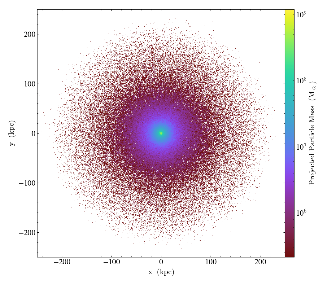
Simple Particle Plot
You can also use yt to make particle-only plots. This script shows how to plot all the particle x and y positions in a dataset, using the particle mass to set the color scale. See Particle Plots for more information.
import yt

# load the dataset
ds = yt.load("IsolatedGalaxy/galaxy0030/galaxy0030")

# create our plot
p = yt.ParticlePlot(
    ds,
    ("all", "particle_position_x"),
    ("all", "particle_position_y"),
    ("all", "particle_mass"),
    width=(0.5, 0.5),
)

# pick some appropriate units
p.set_axes_unit("kpc")
p.set_unit(("all", "particle_mass"), "Msun")

# save result
p.save()
Non-spatial Particle Plots
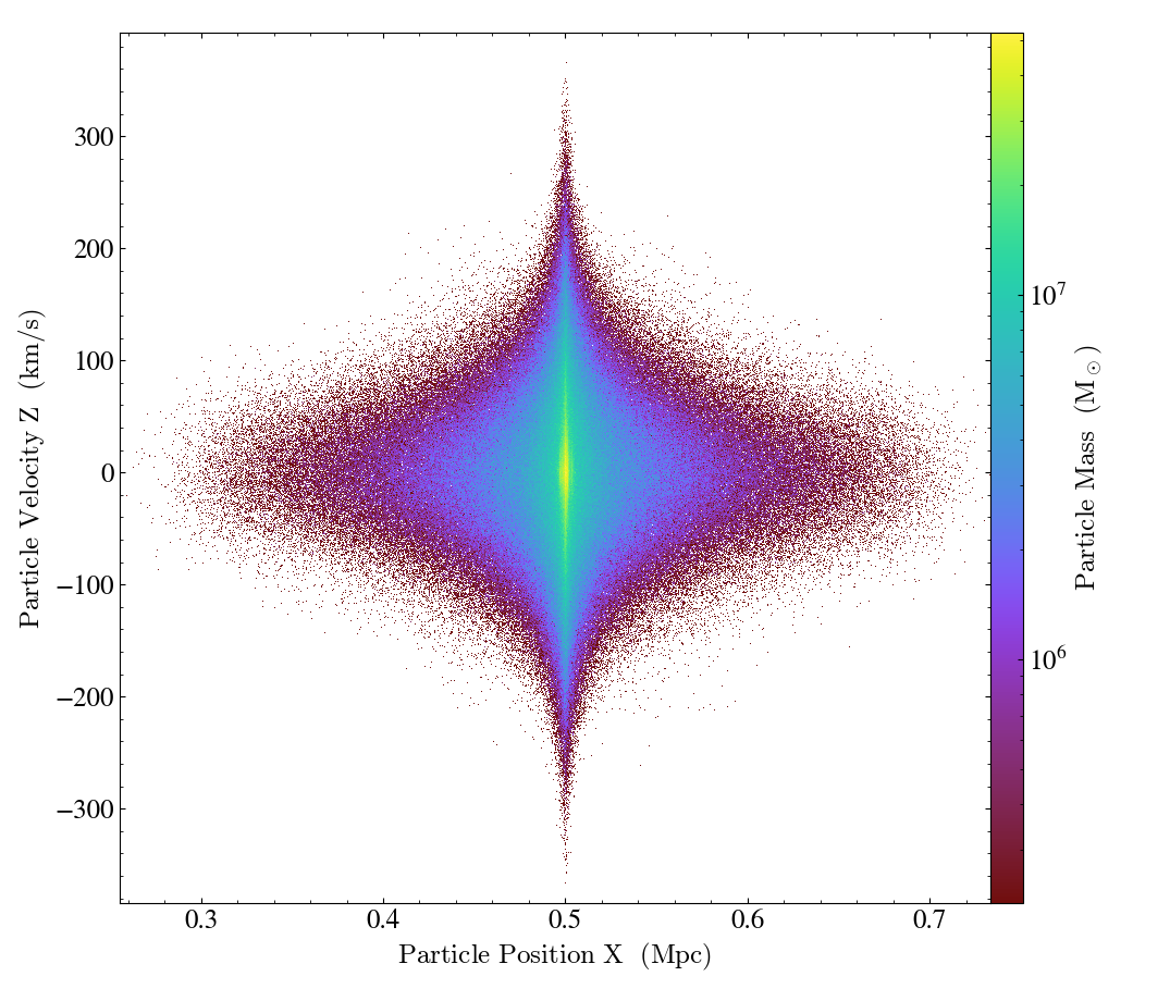
You are not limited to plotting spatial fields on the x and y axes. This example shows how to plot the particle x-coordinates versus their z-velocities, again using the particle mass to set the colorbar. See Particle Plots for more information.
import yt

# load the dataset
ds = yt.load("IsolatedGalaxy/galaxy0030/galaxy0030")

# create our plot
p = yt.ParticlePlot(
    ds,
    ("all", "particle_position_x"),
    ("all", "particle_velocity_z"),
    [("all", "particle_mass")],
)

# pick some appropriate units
p.set_unit(("all", "particle_position_x"), "Mpc")
p.set_unit(("all", "particle_velocity_z"), "km/s")
p.set_unit(("all", "particle_mass"), "Msun")

# save result
p.save()
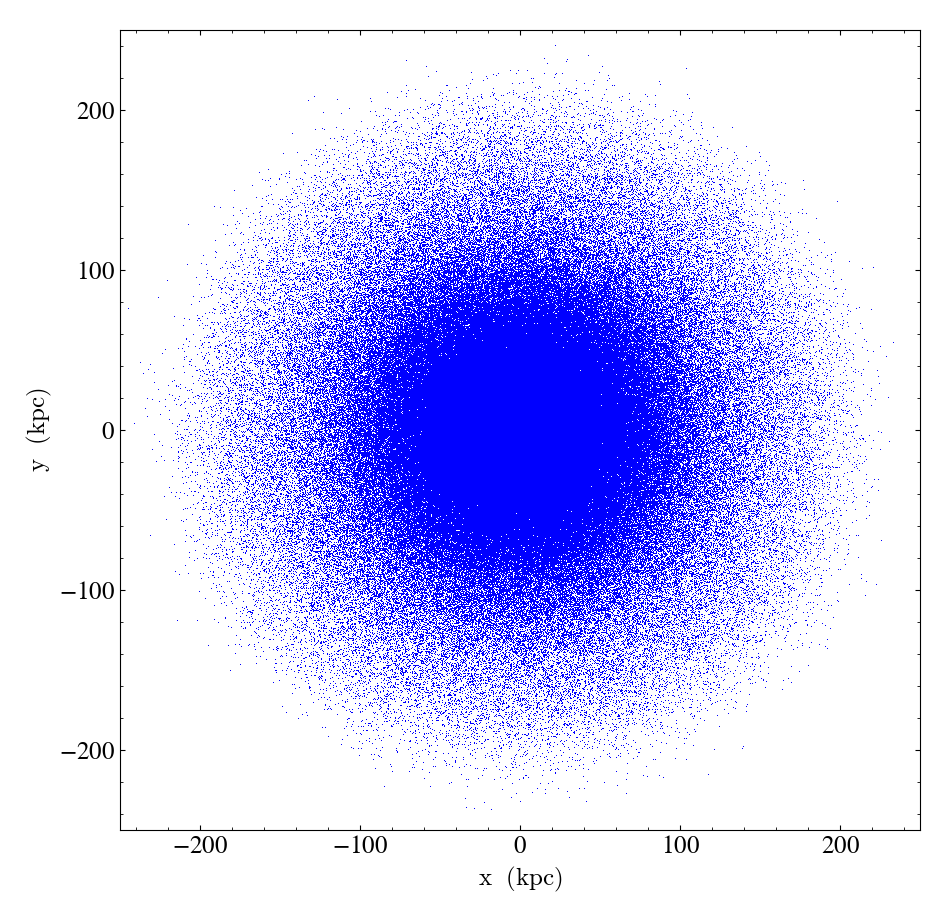
Single-color Particle Plots
If you don’t want to display a third field on the color bar axis, simply pass in a color string instead of a particle field. See Particle Plots for more information.
import yt

# load the dataset
ds = yt.load("IsolatedGalaxy/galaxy0030/galaxy0030")

# create our plot
p = yt.ParticlePlot(
    ds, ("all", "particle_position_x"), ("all", "particle_position_y"), color="b"
)

# zoom in a little bit
p.set_width(500, "kpc")

# save result
p.save()
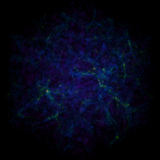
Simple Volume Rendering
Volume renderings are 3D projections rendering isocontours in any arbitrary field (e.g. density, temperature, pressure, etc.) See 3D Visualization and Volume Rendering for more information.
import yt

# Load the dataset.
ds = yt.load("Enzo_64/DD0043/data0043")

# Create a volume rendering, which will determine data bounds, use the first
# acceptable field in the field_list, and set up a default transfer function.

# This will save a file named 'data0043_Render_density.png' to disk.
im, sc = yt.volume_render(ds, field=("gas", "density"))

Showing and Hiding Axis Labels and Colorbars
This example illustrates how to create a SlicePlot and then suppress the axes labels and colorbars. This is useful when you don’t care about the physical scales and just want to take a closer look at the raw plot data. See Hiding the Colorbar and Axis Labels for more information.
import yt

ds = yt.load("IsolatedGalaxy/galaxy0030/galaxy0030")
slc = yt.SlicePlot(ds, "x", ("gas", "density"))
slc.save("default_sliceplot.png")

slc.hide_axes()
slc.save("no_axes_sliceplot.png")

slc.hide_colorbar()
slc.save("no_axes_no_colorbar_sliceplot.png")

slc.show_axes()
slc.save("no_colorbar_sliceplot.png")

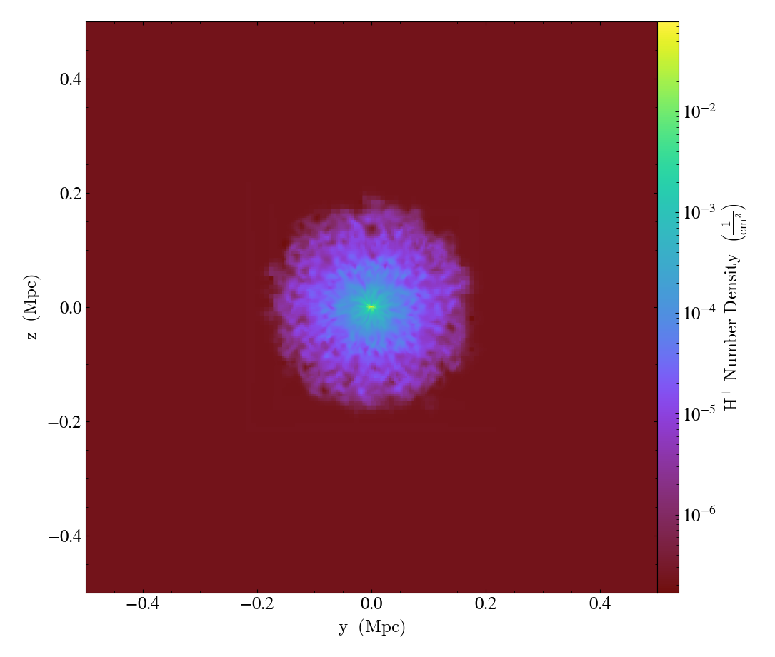
Setting Field Label Formats
This example illustrates how to change the label format for ion species from the default roman numeral style.
import yt

ds = yt.load("IsolatedGalaxy/galaxy0030/galaxy0030")

# Set the format of the ionozation_label to be `plus_minus`
# instead of the default `roman_numeral`
ds.set_field_label_format("ionization_label", "plus_minus")

slc = yt.SlicePlot(ds, "x", ("gas", "H_p1_number_density"))
slc.save("plus_minus_ionization_format_sliceplot.png")
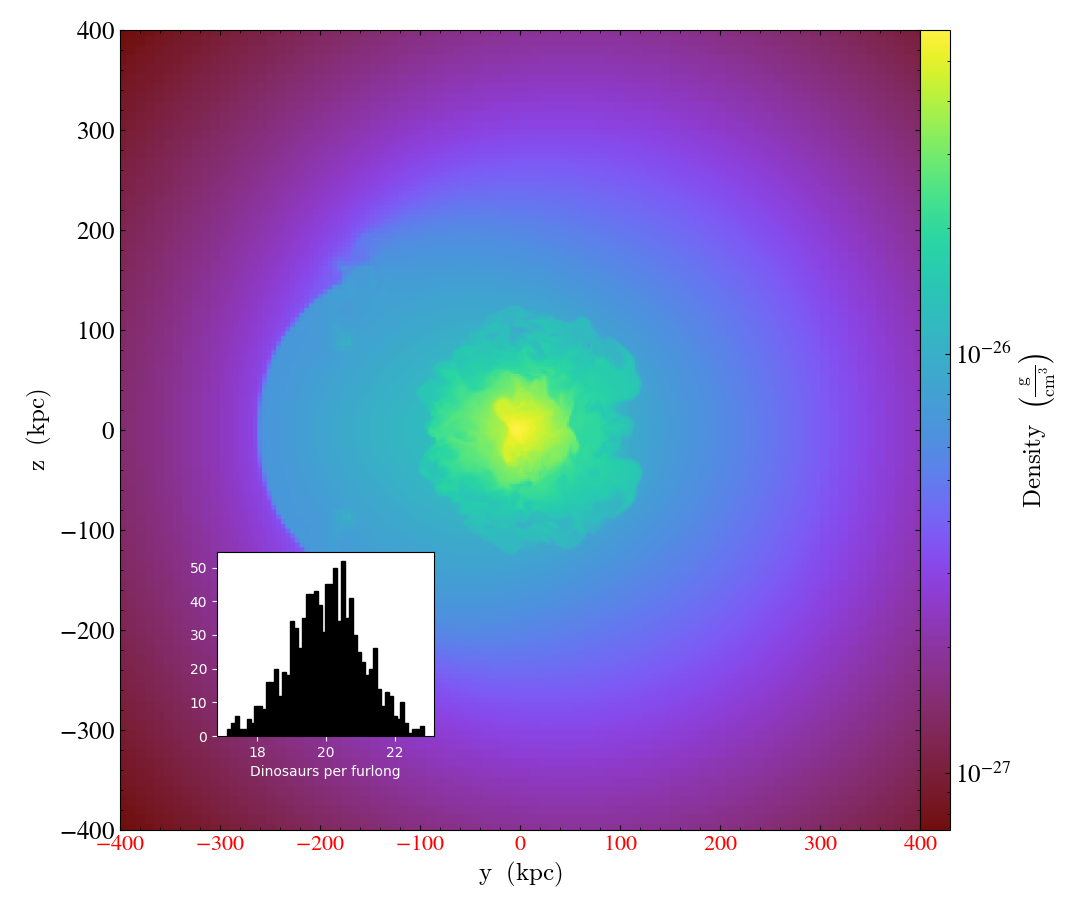
Accessing and Modifying Plots Directly
While often the Plot Window, and its affiliated Plot Modifications: Overplotting Contours, Velocities, Particles, and More can
cover normal use cases, sometimes more direct access to the underlying
Matplotlib engine is necessary. This recipe shows how to modify the plot
window matplotlib.axes.Axes object directly.
See Further customization via matplotlib for more information.
(simple_slice_matplotlib_example.py)
import numpy as np

import yt

# Load the dataset.
ds = yt.load("GasSloshing/sloshing_nomag2_hdf5_plt_cnt_0150")

# Create a slice object
slc = yt.SlicePlot(ds, "x", ("gas", "density"), width=(800.0, "kpc"))

# Rendering should be performed explicitly *before* any modification is
# performed directly with matplotlib.
slc.render()

# Get a reference to the matplotlib axes object for the plot
ax = slc.plots["gas", "density"].axes

# Let's adjust the x axis tick labels
for label in ax.xaxis.get_ticklabels():
    label.set_color("red")
    label.set_fontsize(16)

# Get a reference to the matplotlib figure object for the plot
fig = slc.plots["gas", "density"].figure

# And create a mini-panel of a gaussian histogram inside the plot
rect = (0.2, 0.2, 0.2, 0.2)
new_ax = fig.add_axes(rect)

n, bins, patches = new_ax.hist(
    np.random.randn(1000) + 20, 50, facecolor="black", edgecolor="black"
)

# Make sure its visible
new_ax.tick_params(colors="white")

# And label it
la = new_ax.set_xlabel("Dinosaurs per furlong")
la.set_color("white")

slc.save()
Changing the Colormap used in a Plot
yt has sensible defaults for colormaps, but there are over a hundred available for customizing your plots. Here we generate a projection and then change its colormap. See Colormaps for a list and for images of all the available colormaps.
import yt

# Load the dataset
ds = yt.load("IsolatedGalaxy/galaxy0030/galaxy0030")

# Create a projection and save it with the default colormap ('cmyt.arbre')
p = yt.ProjectionPlot(ds, "z", ("gas", "density"), width=(100, "kpc"))
p.save()

# Change the colormap to 'cmyt.dusk' and save again.  We must specify
# a different filename here or it will save it over the top of
# our first projection.
p.set_cmap(field=("gas", "density"), cmap="cmyt.dusk")
p.save("proj_with_dusk_cmap.png")

# Change the colormap to 'hot' and save again.
p.set_cmap(field=("gas", "density"), cmap="hot")
p.save("proj_with_hot_cmap.png")
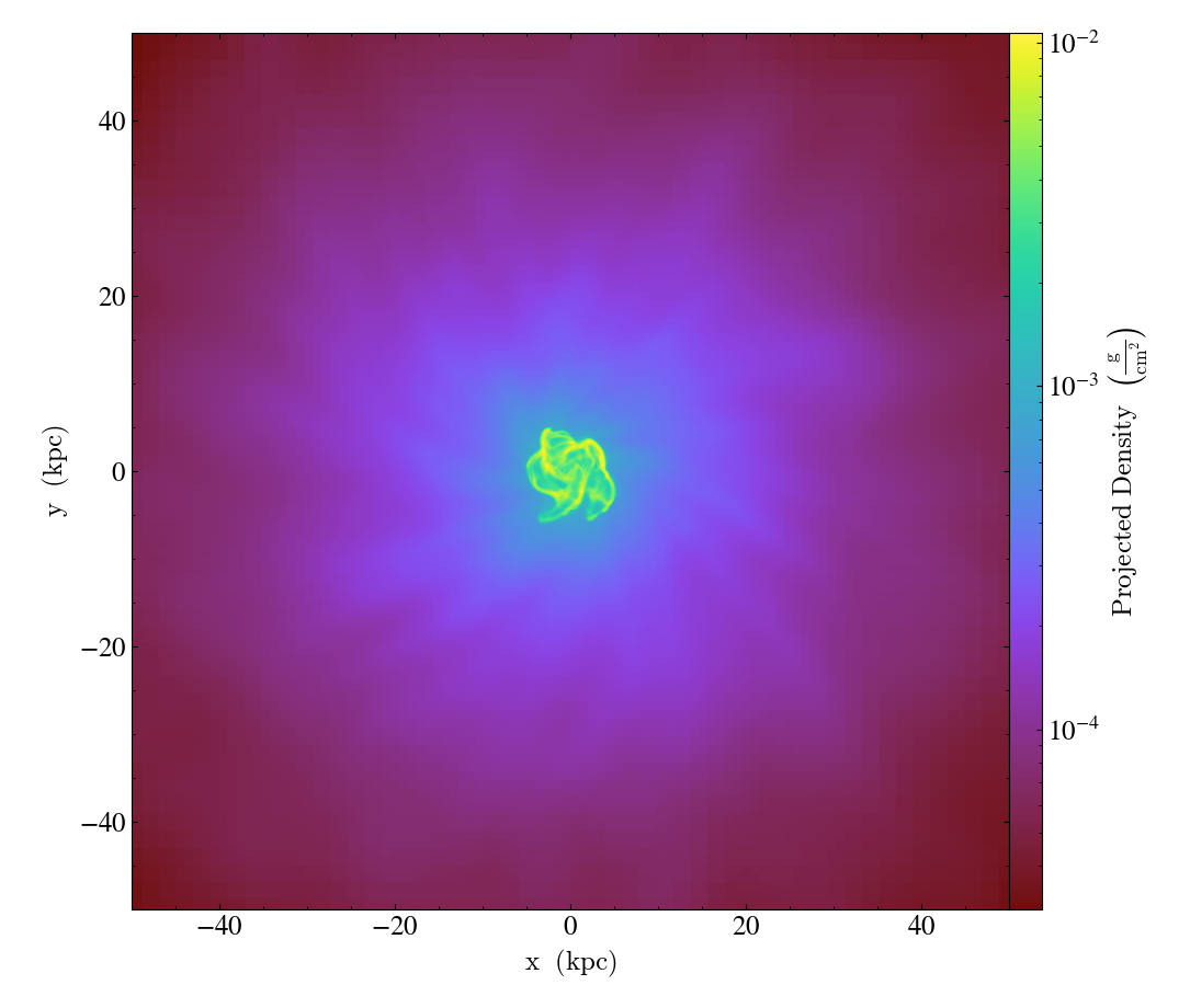
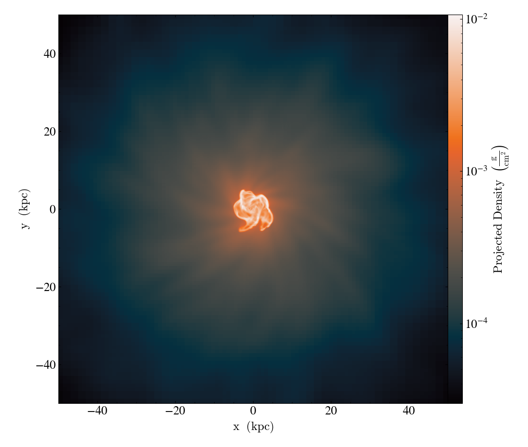
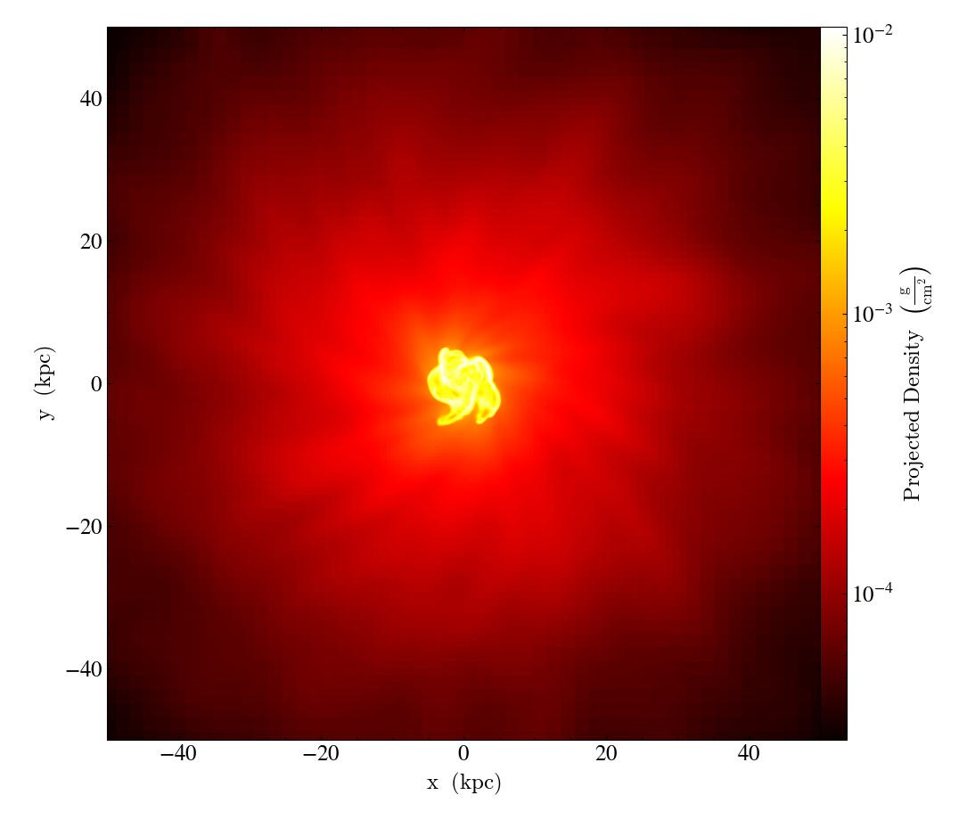
Image Background Colors
Here we see how to take an image and save it using different background colors.
In this case we use the Simple Volume Rendering recipe to generate the image, but it works for any NxNx4 image array (3 colors and 1 opacity channel). See 3D Visualization and Volume Rendering for more information.
import yt

# This shows how to save ImageArray objects, such as those returned from
# volume renderings, to pngs with varying backgrounds.

# First we use the simple_volume_rendering.py recipe from above to generate
# a standard volume rendering.

ds = yt.load("Enzo_64/DD0043/data0043")
im, sc = yt.volume_render(ds, ("gas", "density"))
im.write_png("original.png", sigma_clip=8.0)

# Our image array can now be transformed to include different background
# colors.  By default, the background color is black.  The following
# modifications can be used on any image array.

# write_png accepts a background keyword argument that defaults to 'black'.
# Other choices include:
# black (0.,0.,0.,1.)
# white (1.,1.,1.,1.)
# None  (0.,0.,0.,0.) <-- Transparent!
# any rgba list/array: [r,g,b,a], bounded by 0..1

# We include the sigma_clip=8 keyword here to bring out more contrast between
# the background and foreground, but it is entirely optional.

im.write_png("black_bg.png", background="black", sigma_clip=8.0)
im.write_png("white_bg.png", background="white", sigma_clip=8.0)
im.write_png("green_bg.png", background=[0.0, 1.0, 0.0, 1.0], sigma_clip=8.0)
im.write_png("transparent_bg.png", background=None, sigma_clip=8.0)


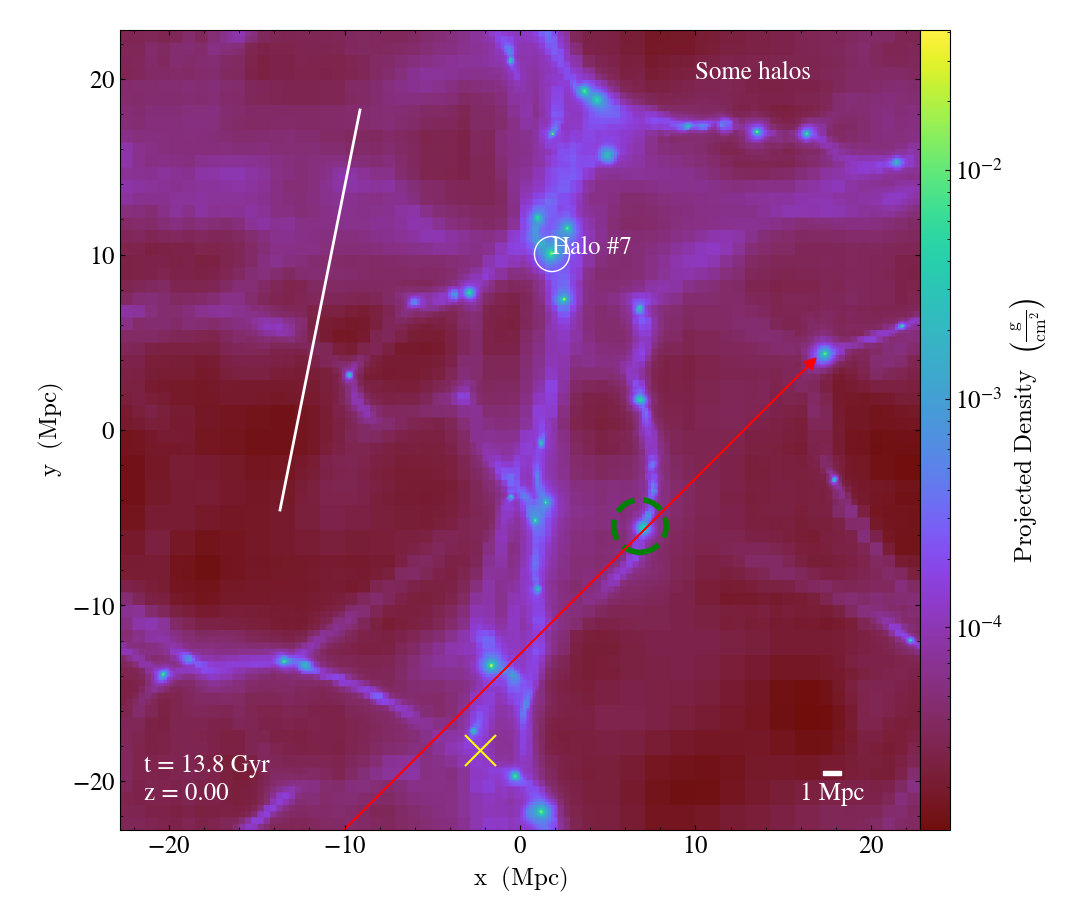
Annotating Plots to Include Lines, Text, Shapes, etc.
It can be useful to add annotations to plots to show off certain features and make it easier for your audience to understand the plot’s purpose. There are a variety of available plot modifications one can use to add annotations to their plots. Below includes just a handful, but please look at the other plot modifications to get a full description of what you can do to highlight your figures.
import yt

ds = yt.load("enzo_tiny_cosmology/DD0046/DD0046")
p = yt.ProjectionPlot(ds, "z", ("gas", "density"))
p.annotate_sphere([0.54, 0.72], radius=(1, "Mpc"), coord_system="axis", text="Halo #7")
p.annotate_sphere(
    [0.65, 0.38, 0.3],
    radius=(1.5, "Mpc"),
    coord_system="data",
    circle_args={"color": "green", "linewidth": 4, "linestyle": "dashed"},
)
p.annotate_arrow([0.87, 0.59, 0.2], coord_system="data", color="red")
p.annotate_text([10, 20], "Some halos", coord_system="plot")
p.annotate_marker([0.45, 0.1, 0.4], coord_system="data", color="yellow", s=500)
p.annotate_line([0.2, 0.4], [0.3, 0.9], coord_system="axis")
p.annotate_timestamp(redshift=True)
p.annotate_scale()
p.save()
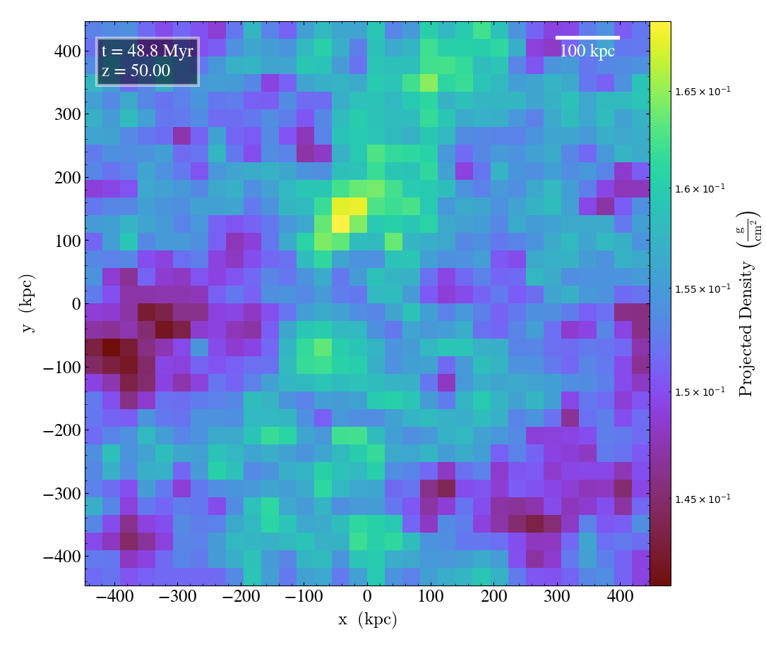
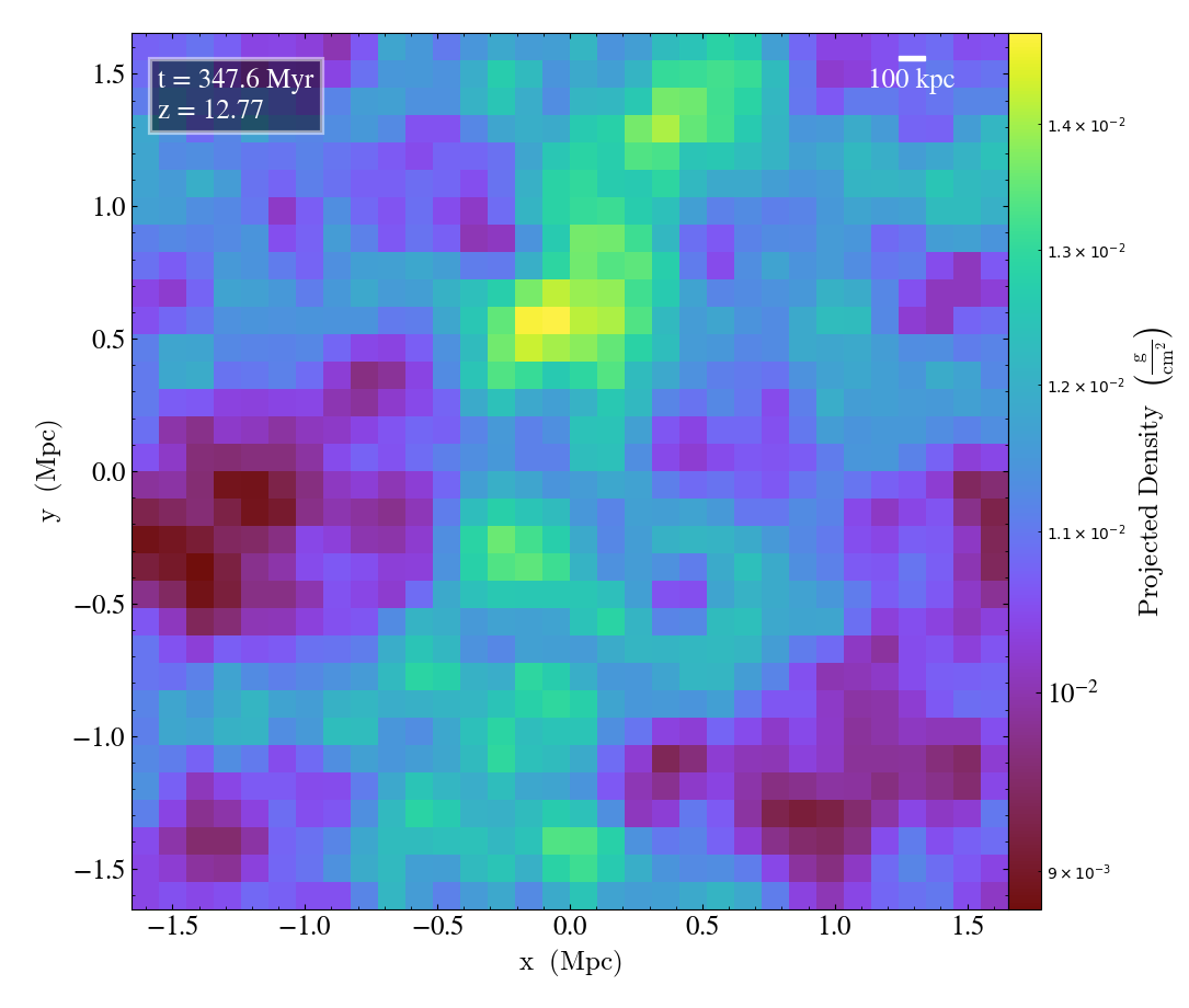
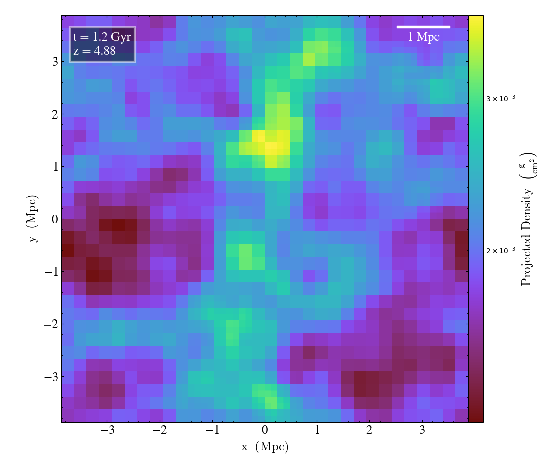
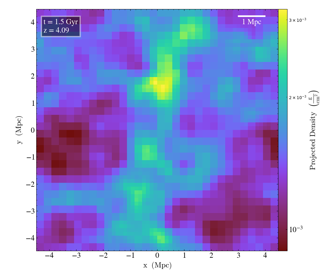
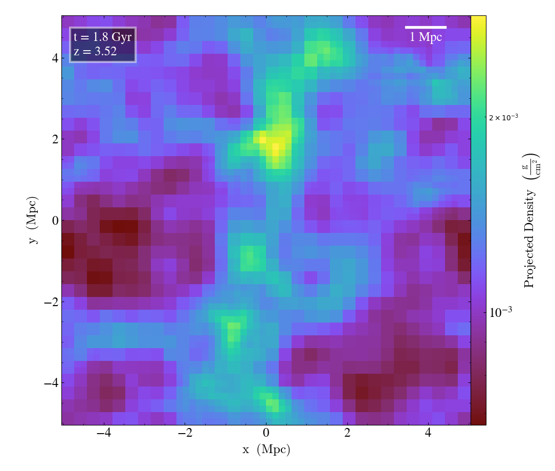
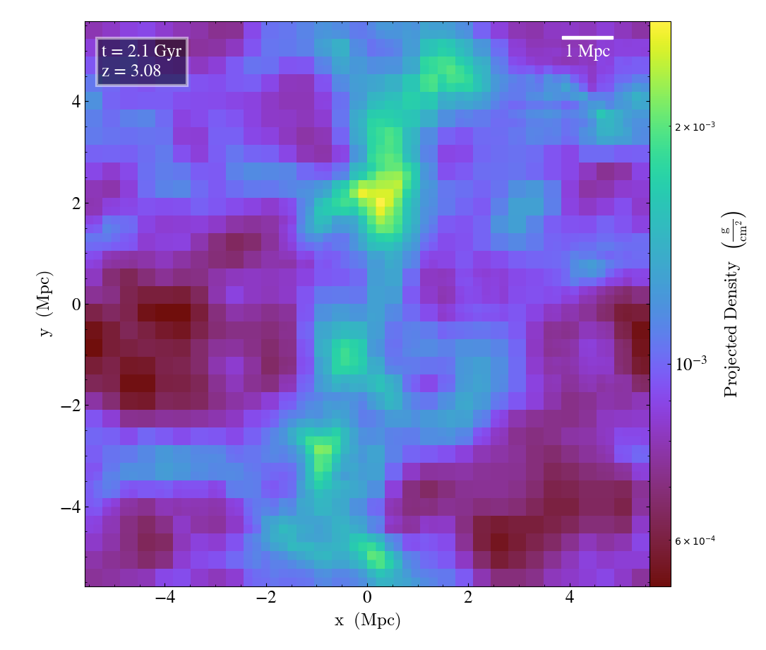
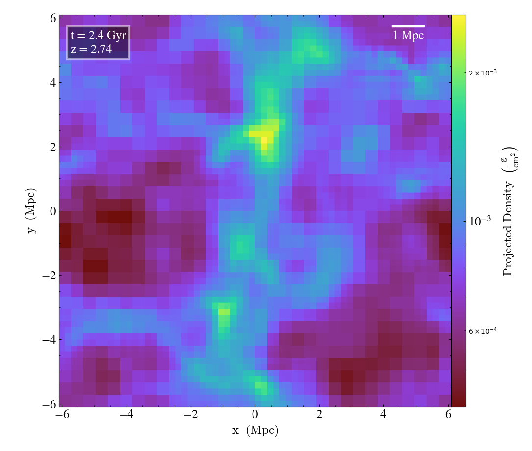
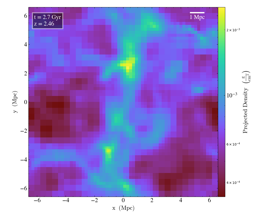
Annotating Plots with a Timestamp and Physical Scale
When creating movies of multiple outputs from the same simulation (see Time Series Analysis), it can be helpful to include a timestamp and the physical scale of each individual output. This is simply achieved using the annotate_timestamp() and annotate_scale() callbacks on your plots. For more information about similar plot modifications using other callbacks, see the section on Plot Modifications.
(annotate_timestamp_and_scale.py)
import yt

ts = yt.load("enzo_tiny_cosmology/DD000?/DD000?")
for ds in ts:
    p = yt.ProjectionPlot(ds, "z", ("gas", "density"))
    p.annotate_timestamp(corner="upper_left", redshift=True, draw_inset_box=True)
    p.annotate_scale(corner="upper_right")
    p.save()